Components
Components are one of the key building blocks of the design system. Each component has been designed and coded to solve a specific UI problem, such as presenting a list of options, enabling submission of a form, providing feedback to the user, and so on.
Shortcuts for some of our components:
Atoms
Badges @relax/badges@8.16.11
Small and adaptive badge for adding context to just about any content.
Installation
If you do not want to use the complete bundle, you can install the component separately.$ npm i @relax/badgesUsing styles
@import '@relax/badges';Usage
Badges are used to tag content, and for selection purposes.
Types
- Default
- Invert
- White
- Primary
- Success
- Warning
- Danger
- Default
- Default
- Inverted
- White
- Primary
- Success
- Warning
- Danger
- With icon
- With icon
- With icon and remove
- With remove
<span class="relax-badge [relax-badge[-default|-invert|-white|-primary|-success|-warning|-danger|]]">A badge!</span>Anatomy
- Primary
- Default
Text label
Text labels describe the action or selection. Text labels should be short, concise and descriptive.
Specs
Buttons @relax/buttons@8.16.11
Buttons express what action will occur when the user clicks or touches it. Buttons are used to initialize an action, either in the background or foreground of an experience.
Installation
If you do not want to use the complete bundle, you can install the component separately.$ npm i @relax/buttonsUsing styles
@import '@relax/buttons';Usage
Buttons communicate actions that uses can take.
Principles
- Buttons should indicate that they can trigger an action.
- Buttons should be easy to find among other elements, including other buttons.
- A button's action and state should be clear.
Types
- No spacing, no background or outline, link button
- No background or outline, text button
- Outlined, secondary button
- Filled, primary button
- Filled, warning button
- Small Outlined, secondary button
- Small Filled, primary button
- Small Filled, warning button
- Icon button, no label
Hierarchy and placement
Hierarchy
A single primary button
A layout/view should contain a single primary button that makes it clear that other buttons have less importance in the hierarchy. This primary button commands the most attention.
Other buttons
An view can show more than one button in a layout at a time, so a primary button can be accompanied by secondary or text buttons that perform less important actions.
Placement
Are you ready for this?
Are you ready for this?
Secondary buttons
Secondary buttons are, secondary. They contain actions that are important, but not the primary action.
Are you ready for this?
<button type="button" class="relax-button">
  Button
</button>
States
Primary button
The primary button is the preferred call-to-action button. The button is used to dictate what the primary action of a view is. Never use more than one primary button for one view.
Are you ready for this?
<button type="button" class="relax-button relax-button--primary">
  Button
</button>
States
Warning button
The warning button is used for actions that demands attention and will make irreversible changes.
Do you want to delete this customer?
<button type="button" class="relax-button relax-button--warning">
  Button
</button>
States
Small button
All buttons can be smaller buttons, except icon buttons.
<button type="button" class="relax-button relax-button--small">Small button</button>Text button
Text buttons are typically used for less-pronounced actions.
Are you ready for this?
<button type="button" class="relax-button relax-button--text">
  Text button
</button>
States
- Title
- Title
- Title
- Title
- Title
- Title
- Enabled
- Disabled
- Active
- Hovered
- Focused
- Focus + Hovered
Link as buttons and buttons as links
If you want to use a link as a button or a button as a link, use these classes
This is a link as a button
This is a
<a href="/" class="relax-button relax-link">Link as a button</a>
<button type="button" class="relax-button relax-link">
  Button as a link
</button>
Progress button
Are you ready for this?
<button type="button" class="relax-button relax-button--primary [relax-is-processing|relax-is-doneProcessing]">
  <span id="progress-2" class="relax-button-content">Processing</span>
  <progress aria-labelledby="progress-2" max="100" value="0"></progress>
</button>
States
- Default primary button state
- :active
- :hover
- :focus
- Default in progress state
- Done
Buttons with icon
All buttons can have icons.
<button type="button" class="relax-button [relax-icon-ui-<iconName>] [relax-button-link|relax-button-icon--right]">
  [<span class="relax-button-inner">
   ...</span>
    <svg ...></svg>
  </span>]
</button>
Button icon
If you want to use an icon as a button, just use relax-button relax-button--icon and your desired icon background class.
<button class="relax-button relax-button--icon relax-icon-ui-trashcan" type="button"></button>Anatomy
- Link button
- Text label
- No outline or padding
- Icon (optional)
- Text button
- Text label
- No outline
- Icon (optional)
- Secondary button
- Text label
- Inverse filled and with outline
- Icon (optional)
- Primary button
- Text label
- Filled
- Icon (optional)
- Icon button
- No Text label
- No outline (optional)
- Icon
Text label
Text labels describe the action that will occur if a user taps a button. If a text label is not used, an icon should be present to signify what the button does. Text labels should be short, concise and descriptive.
Specs
Emblems @relax/emblem@8.16.11
Emblems..
Ebbe Grävare AB ORG.NR 597142-XXXX
Installation
If you do not want to use the complete bundle, you can install the component separately.$ npm i @relax/emblemUsing styles
@import '@relax/emblem';Usage
- Customer mood
- Customer rating
Anatomy
- Mood emblem
- Icon describing mood
- Rating emblem
- Rating
Specs
Implementation
<span class="relax-emblem relax-rating">4</span> <span class="relax-emblem relax-mood relax-parrot"></span>Loaders @relax/loader@8.16.11
Use the loader component to communicate to the user that an action is being processed and is awaiting output or result. The purpose is to prevent the user from taking other actions that might interrupt the current action/process.
Installation
If you do not want to use the complete bundle, you can install the component separately.$ npm i @relax/loaderUsing styles
@import '@relax/loader';Usage
Types
- Not contained
- Inside buttons
Inside buttons
On primary buttons, the loader (white #ffffff) should appear centered in the button (depressed state) and replace the button text. The loader should only appear if the action or request takes more than 1000ms to process.
Other usage
The larger blue loader can be used to communicate that content or data is loading into, for example, a card, panel, table or even an entire page.
Implementation
<div class="relax-loader">
  <svg xmlns="http://www.w3.org/2000/svg" class="relax-loader-icon" viewBox="0 0 70 26">
    <circle class="relax-loader-circle" cx="9" cy="13" r="4" fill="#113EBA" />
    <circle class="relax-loader-circle" cx="32" cy="13" r="4" fill="#113EBA" />
    <circle class="relax-loader-circle" cx="55" cy="13" r="4" fill="#113EBA" />
  </svg>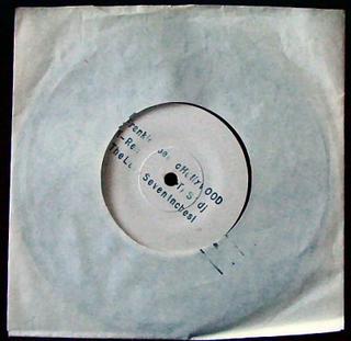
</div>Media @relax/media@8.16.11
Installation
If you do not want to use the complete bundle, you can install the component separately.$ npm i @relax/mediaUsing styles
@import '@relax/media';Implementation
<figure role="img" aria-labelledby="relax-last-seven-inches-caption">
  <img alt="A picture of a seven inch record in a thin paper sleeve. The record is Frankie Goes to Hollywood - Relax" src="https://upload.wikimedia.org/wikipedia/en/4/4a/Relax_Last_Seven_Inches.jpg" longdesc="https://en.wikipedia.org/wiki/File:Relax_Last_Seven_Inches.jpg"/>
  <figcaption id="relax-last-seven-inches-caption">
    By Personal camera, <a href="//en.wikipedia.org/wiki/File:Relax_Last_Seven_Inches.jpg" title="This image is of a cover of an audio recording, and the copyright for it is most likely owned by either the publisher of the work or the artist(s) which produced the recording or cover artwork in question.">Fair use</a>, <a href="https://en.wikipedia.org/w/index.php?curid=7795516">Link</a>
  </figcaption>
</figure>Notifications @relax/notifications@8.16.11
Provide contextual feedback messages for typical user actions with the handful of available and flexible alert messages
Installation
If you do not want to use the complete bundle, you can install the component separately.$ npm i @relax/notificationsUsing styles
@import '@relax/notifications';Usage
Large vs. small notifications
Use notifications to indicate the status of an event or action, for example saving a change. If the change loads a new page, the notification should span the entire width of the content container (100%). If the change is within the page, for example inside a panel, use a small notification (toast) inline with the buttons that were used to make the change (save, submit, etc.).Message
The body of the notification should be contained within two lines. Be descriptive and include any troubleshooting actions or next steps. When possible, communicate the main message using just the title.Dismissal
All notifications can have at least one method of dismissal. Typically, it is a small “x” in the upper right hand corner. Some notifications should not be dismissable, for example warnings about overdue payments, or status of a particular view.Types
- This is a general notification.
- This is a general notification.
- Normal notification
- Toast
- Hero notification
Toasts
You can use the notification component as toasts aswell. Just add the .relax-notification-toast-class!
Toast Notifications
Toast Notifications slide in and out a page from the top-right corner. Actionable notifications do not appear on mobile screen widths.
Inline Notifications
Inline Notifications appear near its related item.
<div class="relax-notification relax-notification--success relax-notification-toast">
  This is a notification of a successful action or event.
</div>
Hero
You can use the notification component as hero aswell. Just add the .relax-notification-hero-class!
Endring av polisen feilet
Feilkode #632<div class="relax-notification relax-notification--error relax-notification-hero">
<div class="relax-notification-content">
<div>
<h1>Endring av polisen feilet</h1><span class="relax-error-code"><strong>Feilkode #632</strong><span><br>
<span class="relax-error-message">Fikk ikke kontakt med server. Vennligst prøv igjen senere. Hvis problemet vedvarer..</span></span></span>
</div>
<ul style="list-style: none; margin: 0; margin-top: auto;">
<li><button class="relax-button relax-button--small relax-button-link relax-icon-ui-arrow-right--white" type="button">Gå til denne tjenesten</button></li>
<li><button class="relax-button relax-button--small relax-button-link relax-icon-ui-arrow-right--white" type="button">Rapporter feilen her</button></li>
</ul>
</div>
</div>States
This is a notification of a successful action or event.
Lorem ipsum dolor sit amet, consectetur adipiscing elit, sed do eiusmod tempor incididunt ut labore et dolore magna aliqua.
- This is a notification with some information.
- This is a notification of a failed action or event.
- Warning, something happened, you need to pay attention
- Something is in progress.
- This is a general notification.
<div class="relax-notification[--[general|error|success|info|warning|progress]]">
  <div class="relax-notification-content">
    <p>
      This is a general notification.
    </p>
  </div>
</div>
Dismiss
A notification can be dismissed.
This is a notification of a successful action or event.
Lorem ipsum dolor sit amet, consectetur adipiscing elit, sed do eiusmod tempor incididunt ut labore et dolore magna aliqua.
<div class="relax-notification relax-notification--general">
  <div class="relax-notification-content">
    <p>
      This is a general notification.
    </p>
  </div>
  <button type="button" class="relax-notification-close"><span class="relax-axe-sr-only">Close</span></button>
</div>
Anatomy
This is a notification of a successful action or event.
Lorem ipsum dolor sit amet, consectetur adipiscing elit, sed do eiusmod tempor incididunt ut labore et dolore magna aliqua.
- Lorem ipsum dolor sit amet, consectetur adipiscing elit.
Endring av polisen feilet
Feilkode #632
- Notification
- Fill (State based)
- Title (optional)
- Message
- Close (optional)
- Toast
- Fill (State based)
- Title (optional)
- Close (optional)
- Notification hero
- Fill (State based)
- Title
- Message
- Actionable links (optional)
Specs
Popover @relax/popover@8.16.11
Installation
If you do not want to use the complete bundle, you can install the component separately.$ npm i @relax/popoverUsing styles
@import '@relax/popover';Usage
- Invoices⌥ + 3 Denne fliken gir deg.. Lorem ipsum dolor sit amet, consectetur adipiscing elit. Suspendisse venenatis, libero vitae dapibus rutrum, urna risus fringilla ligula, non mattis velit augue...
- Invoices⌥ + 3
- Invoices⌥ + 3 Denne fliken gir deg.. Lorem ipsum dolor sit amet, consectetur adipiscing elit. Suspendisse venenatis, libero vitae dapibus rutrum, urna risus fringilla ligula, non mattis velit augue...
- Invoices⌥ + 3 Denne fliken gir deg.. Lorem ipsum dolor sit amet, consectetur adipiscing elit. Suspendisse venenatis, libero vitae dapibus rutrum, urna risus fringilla ligula, non mattis velit augue...
- Invoices⌥ + 3
- Invoices⌥ + 3 Denne fliken gir deg.. Lorem ipsum dolor sit amet, consectetur adipiscing elit. Suspendisse venenatis, libero vitae dapibus rutrum, urna risus fringilla ligula, non mattis velit augue...
Anatomy
- Invoices⌥ + 3 Denne fliken gir deg.. Lorem ipsum dolor sit amet, consectetur adipiscing elit. Suspendisse venenatis, libero vitae dapibus rutrum, urna risus fringilla ligula, non mattis velit augue...
- Invoices⌥ + 3
Specs
Implementation
An example on how to implement it with JavaScript
const addPopover = element => {
  const popover = document.createElement('div');
  const title = document.createElement('span');
  const titleText = document.createTextNode(element.getAttribute('data-popover-title'));
  const shortcut = document.createElement('kbd');
  const shortcutText = document.createTextNode(element.getAttribute('data-shortcut'));
  const description = document.createElement('span');
  const descriptionText = document.createTextNode(element.getAttribute('data-popover-text'));

  popover.classList.add('relax-popover');
  popover.classList.add(`relax-popover--${element.getAttribute('data-popover')}`);

  title.classList.add('relax-popover-title');
  title.appendChild(titleText);

  shortcut.classList.add('relax-popover-shortcut');
  shortcut.appendChild(shortcutText);

  description.classList.add('relax-popover-text');
  description.appendChild(descriptionText);

  title.appendChild(shortcut);

  popover.appendChild(title);
  popover.appendChild(description);

  element.parentNode.insertBefore(popover, element);
};

const removeElements = elements => {
  if (elements && elements.length) {
    for (let i = 0; i < elements.length; i++) {
      elements[i].parentNode.removeChild(elements[i]);
    }
  }
};

const popoverElements = document.querySelectorAll('[data-popover]');

popoverElements.forEach(function(action) {
  let delay;
  action.onmouseenter = function() {
    delay = setTimeout(function() {
      addPopover(action);
    }, 1000);
  };

  action.onmouseleave = function() {
    clearTimeout(delay);
    setTimeout(function() {
      removeElements(document.querySelectorAll('.relax-popover'));
    }, 100);
  };
});
<button
type="button"
data-popover="left"
data-shortcut="⌥ + 1"
data-popover-title="Menu"
data-popover-text="Denne fliken gir deg.. Lorem ipsum dolor sit amet, consectetur adipiscing elit. Suspendisse venenatis, libero vitae dapibus rutrum, urna risus fringilla ligula, non mattis velit augue..."
class="menubar-action-button menu-button"
>
<span class="relax-axe-sr-only">Menu</span>
</button><div class="relax-popover [relax-small] relax-[left|right|top|bottom]">
<span class="relax-popover-title">Invoices<kbd class="relax-popover-shortcut">⌥ + 3</kbd></span>
<span class="relax-popover-text">
Denne fliken gir deg.. Lorem ipsum dolor sit amet, consectetur adipiscing elit. Suspendisse venenatis, libero vitae dapibus rutrum, urna risus fringilla ligula, non mattis velit augue...
</span>
</div>Stepper @relax/stepper@8.16.11
- Step 1
- Step 2
- Step 3
- Step 4
Installation
If you do not want to use the complete bundle, you can install the component separately.$ npm i @relax/stepperUsing styles
@import '@relax/stepper';Anatomy
- Step 1
- Step 2
- Step 3
- Step 4
Implementation
<div class="relax-stepper">
  <ol>
    <li class="relax-done">
      Step 1
    </li>
    <li class="relax-progress">
      Step 2
    </li>
    <li>
      Step 3
    </li>
    <li>
      Step 4
    </li>
  </ol>
</div>
Specs
Tooltip @relax/tooltip@8.16.11
Tooltips provide additional information upon hover or focus. They often contain helper text that is contextual to an element.
Installation
If you do not want to use the complete bundle, you can install the component separately.$ npm i @relax/tooltipUsing styles
@import '@relax/tooltip';Usage
Principles
- If you have space, don't use tooltips or toggletips. Just provide clear labels and sufficient body text.
- If it's a tooltip you are looking to use, decide whether the tip's content should be provided as the label or description and choose ARIA properties accordingly.
- Don't rely on
titleattributes. They are not keyboard accessible and are not supported in many screen reader setups. - Don't describe toggletips with
aria-describedby. It makes the subject button non-functional to screen reader users. - Don't put interactive content such as close and confirm buttons or links in tooltips or toggletips. This is the job of more complex menu and dialog components.
<input type="text" title="Your name"/>
<label for="tooltip-example-input">
Your Name
</label>
<input type="text" id="tooltip-example-input"/>
Length
Due to its disruptive nature, Tooltip content should be kept to an absolute minimum. For larger sets of content or data, consider using a Passive Modal. The Modal will be triggered when the user clicks the information icon, as opposed to the regular :hoverinteraction of a generic Tooltip.
Interactive elements
The primary purpose of a Tooltip is to provide additional help or context to an item. Therefore, they should contain read-only text. The use of interactive elements, such as Buttons or Links, is discouraged.
Types
- ...is a common graphical user interface element.
- In text
- With icon buttons
Implementation
<a href="/" data-tooltip-top data-tooltip="A tooltip">Top</a>
<a href="/" data-tooltip-right data-tooltip="A tooltip">Right</a>
<a href="/" data-tooltip-left data-tooltip="A tooltip">Left</a>
<a href="/" data-tooltip-bottom data-tooltip="A tooltip">Bottom</a>
<button class="relax-button relax-button--icon relax-icon-ui-help-circle-outline relax-tooltip--open" data-tooltip="A tooltip"><span class="relax-axe-sr-only">Button</span></button>$('abbr').hover(
function() {
$(this)
.attr('data-tooltip', $(this).attr('title'))
.removeAttr('title');
},
function() {
$(this).attr('title', $(this).attr('data-tooltip'));
}
);Molecules
Card @relax/cards@8.16.11
A card provide an at-a-glance preview of the content they link to and frequently contain easily consumable content. Use a card pattern when creating a collection of items, where each item surfaces a large amount of information in a similar schema.
A card may be as minimal as having a title with an icon and description to being more detailed to include a chart, live metrics, lists, tables or other data.
Installation
If you do not want to use the complete bundle, you can install the component separately.$ npm i @relax/cardsUsing styles
@import '@relax/cards';Usage
Types
- Card headerAn empty card
- Card headerAn empty card
- Card headerAn empty card
- Normal card
- Normal card with arrow in header
- Large card
Group of Cards
When displaying a group of cards, use ul[class="relax-cards"] with li[class="relax-card"]-items. This will ensure cards are equal height. Card groups automatically uses flex styles to match height between cards in the same row. This will also make the groups of cards more semantic and enhance assistive technology users' experience. Briefly:
- Screen readers provide shortcuts to lists and between list items
- Screen readers enumerate the items so users know how many are available
Header
Sub titlePellentesque ac magna quis sapien egestas lobortis vel sit amet velit. Pellentesque at aliquam enim, sit amet auctor ligula. In placerat vitae lorem ut laoreet. Ut blandit efficitur augue at lacinia. Quisque pellentesque semper sapien ut varius. Quisque maximus consequat lacus, eu cursus diam porttitor eget. Nunc fermentum sem eu turpis ornare, a blandit leo gravida.Header
Sub titlePellentesque ac magna quis sapien egestas lobortis vel sit amet velit. Pellentesque at aliquam enim, sit amet auctor ligula. In placerat vitae lorem ut laoreet. Ut blandit efficitur augue at lacinia. Quisque pellentesque semper sapien ut varius. Quisque maximus consequat lacus, eu cursus diam porttitor eget. Nunc fermentum sem eu turpis ornare, a blandit leo gravida.Header
Sub titlePellentesque ac magna quis sapien egestas lobortis vel sit amet velit. Pellentesque at aliquam enim, sit amet auctor ligula. In placerat vitae lorem ut laoreet. Ut blandit efficitur augue at lacinia. Quisque pellentesque semper sapien ut varius. Quisque maximus consequat lacus, eu cursus diam porttitor eget. Nunc fermentum sem eu turpis ornare, a blandit leo gravida.
<ul class="relax-cards">
  <li class="relax-card">
    ...
  </li>
</ul>
Fluid card
A fluid card takes up the width of its container.
- John DoeLorem ipsum dolor sit amet, consectetur adipiscing elit. Donec quis bibendum massa. Aenean ultricies aliquet metus id accumsan. Nullam sed condimentum lectus, sed fermentum nunc
- John DoeLorem ipsum dolor sit amet, consectetur adipiscing elit. Donec quis bibendum massa. Aenean ultricies aliquet metus id accumsan. Nullam sed condimentum lectus, sed fermentum nunc
- John DoeLorem ipsum dolor sit amet, consectetur adipiscing elit. Donec quis bibendum massa. Aenean ultricies aliquet metus id accumsan. Nullam sed condimentum lectus, sed fermentum nunc
<ul class="relax-cards">
  <li class="relax-card relax-card--fluid">
    ...
  <li>
  <li class="relax-card relax-card--fluid">
    ...
  <li>
</ul>
<div class="relax-row">
  <div class="relax-col-12--xs relax-col-6--sm relax-col-4--md relax-col-3--lg relax-col-2--xl">
    <div class="relax-card relax-card--fluid">
      ...
    </div>
  </div>
</div>
Centered cards
A card can center itself inside its container.
<div class="relax-card relax-card--centered">
  <div class="relax-card-header">
    John Doe <span class="relax-badge relax-badge-white relax-icon-ui-bandaid--blue">White</span>
  </div>
  <div class="relax-card-content" style="filter: blur(6px);">
    Lorem ipsum dolor sit amet, consectetur adipiscing elit. Donec quis bibendum massa. Aenean ultricies aliquet metus id accumsan. Nullam sed condimentum lectus, sed fermentum nunc
  </div>
</div>
Anatomy
A card can consist of a title, content and a footer.
Title
Titles describe the subject of the data on a Card. If you want an arrow in the card title, to indicate that this is a link, use .relax-card-header-a with the .relax-card-header class.
Content
The Card's content section lives just below the title, and can be used to provide additional information/content.
Use .relax-card-content for a plain box, .relax-card-table to place a table inside the card, and .relax-card-list for a list of items, links, etc.
Footer
The footer is commonly used for interactive elements, which can be any of the following: secondary buttons, links, and action icons. It can also contain additional informational content, such as plan name or app status.
| With | three | rows |
| With | three | rows |
| With | three | rows |
- John DoeLorem ipsum dolor sit amet, consectetur adipiscing elit. Donec quis bibendum massa. Aenean ultricies aliquet metus id accumsan. Nullam sed condimentum lectus, sed fermentum nunc
- Square teaser
- Header (optional)
- Content
- Footer (optional)
Specs
Implementation
<div class="relax-card [relax-card--large]">
  <div class="relax-card-header [relax-card-header-a]">
    <span class="relax-card-title">Card header</span>
  </div>
  <div class="relax-card-content">
    An empty card
  </div>
</div>
Semantic
A card is always coded semantically. You can use cards with: a, button and div-tags. Please see the source code.
<a class="relax-card" href="/" aria-labelleby="id-to-use-as-label">
  <span class="relax-card-content">...</span>
</a>
<button aria-label="A label to the card" class="relax-card" onclick="" onkeydown="" style="height: 20vh;" tabindex="0" type="button">
  <span class="relax-card-inlay">
    <span class="relax-card-content">...</span>
  </span>
</button>
<div aria-label="A label to the card" class="relax-card" onclick="" onkeydown="" role="link" tabindex="0">
  <div class="relax-card-content">
    ...
  </div>
</div>
<div aria-label="A label to the card" class="relax-card" onclick="" onkeydown="" role="button" tabindex="0">
  <div class="relax-card-content">
    ...
  </div>
</div>
<div class="relax-card relax-interactive">
  <div class="relax-card-header">
    <h2><a href="/">Header link</a></h2>
  </div>
  <div class="relax-card-content">
    ...
  </div>
</div>List @relax/list@8.16.11
Lists consist of related content grouped together and organized vertically.
Installation
If you do not want to use the complete bundle, you can install the component separately.$ npm i @relax/listUsing styles
@import '@relax/list';Usage
Length of lists
Generally, Lists should be used to present simple pieces of information. For more complex sets of data, consider using a Data Table.Order
Arrange List items in a logical way. For example, if the List is about resource use, the default order might be highest resource use to lowest. Grouping items in categories into smaller, more specific lists might be more meaningful in some contexts. Alternatively, organize in alphabetical or numeric order.Text
Use List items that are grammatically parallel. For example, do not mix passive voice with active voice or declarative sentences (statements) with imperative sentences (direct command).For the .relax-list-link-items, you can use a <button> or a <a href="/">-tag.
Types
- Insurances
- Petra Fordal
- Contact Role
- Payment Responsible
- Phone
- +47 951 84 809
- Official Role
- Accountant
- petra.fordal@provenbil.no
- Petra Fordal
- Contact Role
- Payment Responsible
- Phone
- +47 951 84 809
- Official Role
- Accountant
- petra.fordal@provenbil.no
- Default list
- Embedded list
- Embedded list without title
- List with icons
- Preview list
- Embedded preview list
- Lists in lists
Specs
Implementation
<ul class="relax-list [relax-list-item--preview]">
  <li class="relax-list-item">
    <span class="relax-list-itemTitle">...</span>
  </li>
  <li class="relax-list-item">
    <a href="/" class="relax-list-link [relax-icon-products-atv--brown]">
      <span class="relax-list-itemTitle">
        Property
        <small>NOK 123 322</small>
      </span>
    </a>
  </li>
</ul>Modal @relax/modal@8.16.11
Modals communicate information via a secondary window and allow the user to maintain the context of a particular task.
Installation
If you do not want to use the complete bundle, you can install the component separately.$ npm i @relax/modalUsing styles
@import '@relax/modal';Usage
Modals inform users about a specific task and may contain critical information, require decisions, or involve multiple tasks.
Modals contain text and UI controls. They retain focus until dismissed or a required action has been taken. Use dialogs sparingly because they are interruptive.
Modals should never be obscured, either by other elements or the screen edge. Modals always retain focus until dismissed or a required action has been taken.
Modals
Modals may be dismissed in 3 ways:
- Using the “x” in the upper right-hand corner of the Modal
- Pressing the ESC key
- Clicking / touching outside of the Modal area
Dialogs
Dialogs can only be dismissed by taking one of the actions presented.
Types
- Title
- Modal
- Dialog
Anatomy
Header (optional)
Include a heading within the Modal that mirrors the action or button that was clicked by the user.
Body
The body content within a Modal should be as minimal as possible. Components that may be used in Modals include: Form fields, Text Area, Select, and Radio Buttons.
Footer
The footer area of a Modal typically contains a set of actions. Refer to Button guidelines for usage.
- Title
- Title
- Modal
- Dismiss button
- Title (optional)
- Body
- Footer (optional)
- Dialog
- Title (optional)
- Footer
- Actions
Specs
Implementation
<div class="relax-modal relax-is-open">
  <div class="relax-modal-box">
    <button type="button" class="relax-modal-close"></button>
    <div class="relax-modal-title">Title</div>
    <div class="relax-modal-content">
      <p>
        Are you ready for this?
      </p>
    </div>
    <div class="relax-modal-footer">
      <button type="button" class="relax-button">Cancel</button>
      <button type="button" class="relax-button relax-button--primary">Yes</button>
    </div>
  </div>
</div>
Dialog
Implementation
<div class="relax-dialog relax-is-open">
  <div class="relax-dialog-box">
    <div class="relax-dialog-content">
      <p>
        Are you ready for this?
      </p>
    </div>
    <div class="relax-dialog-actions">
      <button type="button" class="relax-button dialog-action">Cancel</button>
      <button type="button" class="relax-button dialog-action relax-button--primary">Yes</button>
    </div>
  </div>
</div>Pagination @relax/pagination@8.16.11
Pagination is used for splitting data, usually lists or tables, into several pages, with a control for navigating to the next or previous page.
| This is | a | table | |
|---|---|---|---|
| With | three | rows | |
| With | three | rows | |
| With | three | rows |
Installation
If you do not want to use the complete bundle, you can install the component separately.$ npm i @relax/paginationUsing styles
@import '@relax/pagination';Usage
Generally, Pagination is used if there are more than 25 items displayed in one view. The default number displayed will vary depending on the context.
Identify the current page
Clearly identify which page the user is on by displaying the current page number. By providing context into how many pages there are in total (eg. 1 of 4 pages), you can help provide clarity around the data displayed.
Variations
- Normal pagination
- First page
- Last page
- Large set, first page
- Large set, last page
- Larger set, last page, with jump to page option
Anatomy
- Paginator
- Arrow icon to browser
- Current page highlighted
- Each element is a button
- On first and last page
- Disabled arrow
- Large datasets
- Text field to jump to page (optional)
Implementation
<div class="relax-pagination-holder">
  <span class="relax-pagination-details">Displaying page <strong>7</strong> of <i>12</i></span>
  <ul class="relax-pagination">
    <li>
      <button type="button" class="relax-pagination-button">
        <span aria-hidden="true">
          <svg class="relax-pagination-navIcon" viewBox="0 0 24 24" height="24" width="24" xmlns="http://www.w3.org/2000/svg">
            <path d="M15.41 7.41L14 6l-6 6 6 6 1.41-1.41L10.83 12z"/>
            <path d="M0 0h24v24H0z" fill="none"/>
          </svg>
        </span>
      </button>
    </li>
    <li>
      <button type="button" class="relax-pagination-button">1</button>
    </li>
    <li>
      <button type="button" class="relax-pagination-button">2</button>
    </li>
    <li>
      <button type="button" class="relax-pagination-button">3</button>
    </li>
    <li>
      <button type="button" class="relax-pagination-button">4</button>
    </li>
    <li>
      <button type="button" class="relax-pagination-button">5</button>
    <li>
      <button type="button" class="relax-pagination-button">6</button>
    </li>
    <li>
      <button type="button" class="relax-pagination-button relax-pagination-button--isActive">7</button>
    </li>
    <li>
      <button type="button" class="relax-pagination-button relax-pagination-button--isDisabled">
        <span aria-hidden="true">
          <svg class="relax-pagination-navIcon" viewBox="0 0 24 24" height="16" width="16" xmlns="http://www.w3.org/2000/svg">
              <path d="M10 6L8.59 7.41 13.17 12l-4.58 4.59L10 18l6-6z"/>
              <path d="M0 0h24v24H0z" fill="none"/>
          </svg>
        </span>
      </button>
    </li>
  </ul>
</div>
Specs
Panel @relax/panel@8.16.11
NEED NEW DESCRIPTION HERE FOR PANELS.
Installation
If you do not want to use the complete bundle, you can install the component separately.$ npm i @relax/panelUsing styles
@import '@relax/panel';Usage
Types
- Basic panel example
- You can also add
.relax-no-paddingto the.relax-panel-content-element to let the content flow with no gutter. - Basic panel example
- Basic panel example
- Basic panel example
- Alle
This is some content- This is a panelWith some grid cellsAs an exampleThis is some preview content
- This is a panel itemThis is a content preview
- This is a panel titleThis is some content
- This is a panel titleThis is some content
- Panel link titlePanel link title
- Basic panel
- No padding
- Border dashed
- Border thick
- Border thick dashed
- Panel with filter
- Panel with menu
- Panel with preview
- Panel with action
- Panel with title
- Panels as links
- Expandable panels
Anatomy
Panel width
Base the width of your panel on the amount of content to be displayed. Perhaps your panel only needs to be 6, or 4 columns wide.
Borders
<div class="relax-panel relax-dashed-border">
  <div class="relax-panel-item">
    <div class="relax-panel-content">
      Basic panel example
    </div>
  </div>
</div>
<div class="relax-panel relax-thick-border">
  <div class="relax-panel-item">
    <div class="relax-panel-content">
      <div class="relax-row">
        <div class="relax-col">Basic panel example</div>
      </div>
    </div>
  </div>
</div>
<div class="relax-panel relax-thick-border relax-dashed-border">
  <div class="relax-panel-item">
    <div class="relax-panel-content">
      <div class="relax-row">
        <div class="relax-col">Basic panel example</div>
      </div>
    </div>
  </div>
</div>
Panel with preview
If you need some content associated with the panel, use a preview element. Add another .relax-panel-item below the main panel item with the .relax-is-preview class to it.
<div class="relax-panel">
  <div class="relax-panel-item relax-panel-item--title">
    <div class="relax-panel-content">
      This is a panel item
    </div>
  </div>
  <div class="relax-panel-item relax-is-preview">
    <div class="relax-panel-content">
      This is a content preview
    </div>
  </div>
</div>
Panel with title
If you need a title to your panels, add another .relax-panel-item, before the main panel item, with the .relax-panel-item--title class to it. Remember to add . class to the following div to fix border/border-radius issues.
<div class="relax-panel">
  <div class="relax-panel-item relax-panel-item--title">
    <div class="relax-panel-content">
      This is a panel title
    </div>
  </div>
  <div class="relax-panel-item">
    <div class="relax-panel-content">
      This is some content
    </div>
  </div>
</div>
Panel with title and button
If you need a button with your title, just add it!
<div class="relax-panel">
  <div class="relax-panel-item relax-panel-item--title">
    <div class="relax-panel-content">
      This is a panel title
      <button type="button" class="relax-panel-action relax-button relax-button--primary relax-button--small">
        Action
      </button>
    </div>
  </div>
  <div class="relax-panel-item">
    <div class="relax-panel-content">
      This is some content
    </div>
  </div>
</div>
Panel with filter
- Alle
<div class="relax-panel">
  <div class="relax-panel-item relax-panel-item--title relax-panel-filter">
    <div class="relax-panel-content relax-panel-withFilter">
      <ul class="relax-panel-filter">
        <li class="relax-panel-filter-item">Alle</li>
        <li class="relax-panel-filter-item"></li>
        <li class="relax-panel-filter-item relax-is-active"></li>
        <li class="relax-panel-filter-item"></li>
      </ul>
    </div>
  </div>
  <div class="relax-panel-item">
    <div class="relax-panel-content">
      This is some content
    </div>
  </div>
</div>
Implementation
<div class="relax-panel">
  <div class="relax-panel-item">
    <div class="relax-panel-content">
      <div class="relax-row">
        <div class="relax-col">Basic panel example</div>
      </div>
    </div>
  </div>
</div>
Specs
Content placeholder @relax/placeholder@8.16.11
A content placeholder can be used to reserve space for conditionally displayed content.
The placeholder informs the user that data could be displayed here, but none was found. It can also be an entry point to find content.
We don't have any documents matching your query.
Installation
If you do not want to use the complete bundle, you can install the component separately.$ npm i @relax/placeholderUsing styles
@import '@relax/placeholder';Usage
Types
- Title
We don't have any documents matching your query.
- TitleOr
Find customer.
Add customer.
- Title
- Adresse i bruk
- Something road 123
123123 Something
Sweden
- Adresse i bruk
- Something road 123
123123 Something
Sweden
- A placeholder with two actions
- A dual placeholder
- A placeholder as an action
<section class="relax-placeholder [relax-contained|relax-action]">
  [
  <header class="relax-placeholder-header <icon>">
    <h2 class="relax-placeholder-title">No documents are listed for this customer.</h2>
  </header>
  <div class="relax-placeholder-actions">
    <button type="button" class="relax-button relax-button--primary">Add Document</button>
  </div>
  ] |
  [
  <section class="relax-placeholder relax-action">
    <button class="relax-placeholder-button relax-icon-ui-plus--blue">Add address</button>
  </section>
  ]
</section>
Anatomy
- Title
We don't have any documents matching your query.
- TitleOr
Find customer.
Add customer.
- Title
- Placeholder with two actions
- Text
- Icon
- Actions
- Dual placeholder
- Text
- Icon
- Actions
- Input (optional)
- Placeholder as a single action
- Icon and text
- Hovered
Specs
Tabs @relax/tabs@8.16.11
Use tabs to alternate between views within the same context, not to navigate to different areas. Staying in place while alternating views is the reason we have tabs in the first place.
Logically chunk the content behind the tabs so users can easily predict what they'll find when they select a given tab.
Use tabs only when users don't need to see content from multiple tabs simultaneously.
Tabs should be parallel in nature. If the tabs are significantly dissimilar, users will interpret them as site navigation.
For more on better practices with tabs: https://www.nngroup.com/articles/tabs-used-right/
Section 1
Lorem ipsum dolor sit amet, consectetur adipiscing elit. Nam euismod, tortor nec pharetra ultricies, ante erat imperdiet velit, nec laoreet enim lacus a velit. Nam luctus, enim in interdum condimentum, nisl diam iaculis lorem, vel volutpat mi leo sit amet lectus. Praesent non odio bibendum magna bibendum accumsan.
Section 2
Nullam at diam nec arcu suscipit auctor non a erat. Sed et magna semper, eleifend magna non, facilisis nisl. Proin et est et lorem dictum finibus ut nec turpis. Aenean nisi tortor, euismod a mauris a, mattis scelerisque tortor. Sed dolor risus, varius a nibh id, condimentum lacinia est. In lacinia cursus odio a aliquam. Curabitur tortor magna, laoreet ut rhoncus at, sodales consequat tellus.
Installation
If you do not want to use the complete bundle, you can install the component separately.$ npm i @relax/tabsUsing styles
@import '@relax/tabs';Usage
When should we use tabbed interfaces?
- When we have lengthy content with multiple headings, each heading can become a tab with its respective content as that tabpanel's content
- When we have progression with multiple steps, and
- When the next section only becomes available when the current section is "complete", or
- When all sections are available at any given time
Types
Section 1
Lorem ipsum dolor sit amet, consectetur adipiscing elit. Nam euismod, tortor nec pharetra ultricies, ante erat imperdiet velit, nec laoreet enim lacus a velit. Nam luctus, enim in interdum condimentum, nisl diam iaculis lorem, vel volutpat mi leo sit amet lectus. Praesent non odio bibendum magna bibendum accumsan.
Section 2
Nullam at diam nec arcu suscipit auctor non a erat. Sed et magna semper, eleifend magna non, facilisis nisl. Proin et est et lorem dictum finibus ut nec turpis. Aenean nisi tortor, euismod a mauris a, mattis scelerisque tortor. Sed dolor risus, varius a nibh id, condimentum lacinia est. In lacinia cursus odio a aliquam. Curabitur tortor magna, laoreet ut rhoncus at, sodales consequat tellus.
- Fluid + large + icons, tabs on bottom
Anatomy
Section 1
Lorem ipsum dolor sit amet, consectetur adipiscing elit. Nam euismod, tortor nec pharetra ultricies, ante erat imperdiet velit, nec laoreet enim lacus a velit. Nam luctus, enim in interdum condimentum, nisl diam iaculis lorem, vel volutpat mi leo sit amet lectus. Praesent non odio bibendum magna bibendum accumsan.
Section 2
Nullam at diam nec arcu suscipit auctor non a erat. Sed et magna semper, eleifend magna non, facilisis nisl. Proin et est et lorem dictum finibus ut nec turpis. Aenean nisi tortor, euismod a mauris a, mattis scelerisque tortor. Sed dolor risus, varius a nibh id, condimentum lacinia est. In lacinia cursus odio a aliquam. Curabitur tortor magna, laoreet ut rhoncus at, sodales consequat tellus.
- Tabs
- Content
- Clear an concise text label
- Icon (optional)
Implementation
<div class="relax-tabs relax-tabs--fluid relax-tabs--large" style="max-width: 25rem; background-color: white;">
  <section aria-labelledby="tab1" id="section1" role="tabpanel" class="relax-tab-panel">
    <h2>Section 1</h2>
    <p>Lorem ipsum dolor sit amet, consectetur adipiscing elit. Nam euismod, tortor nec pharetra ultricies, ante erat imperdiet velit, nec laoreet enim lacus a velit. <a href="/">Nam luctus</a>, enim in interdum condimentum, nisl diam iaculis lorem, vel volutpat mi leo sit amet lectus. Praesent non odio bibendum magna bibendum accumsan.</p>
  </section>
  <section aria-labelledby="tab2" id="section2" role="tabpanel" class="relax-tab-panel relax-tab-panel--selected">
    <h2>Section 2</h2>
    <p>Nullam at diam nec arcu suscipit auctor non a erat. Sed et magna semper, eleifend magna non, facilisis nisl. Proin et est et lorem dictum finibus ut nec turpis. Aenean nisi tortor, euismod a mauris a, mattis scelerisque tortor. Sed dolor risus, varius a nibh id, condimentum lacinia est. In lacinia cursus odio a aliquam. Curabitur tortor magna, laoreet ut rhoncus at, sodales consequat tellus.</p>
  </section>
  <ul role="tablist">
    <li role="presentation">
      <a href="#section1" id="tab1" role="tab" class="relax-icon-ui-pencil--white">Section 1</a>
    </li>
    <li role="presentation">
      <a aria-selected="true" href="#section2" id="tab2" role="tab" class="relax-icon-ui-menu--blue">Section 2</a>
    </li>
  </ul>
</div>
Specs
Timeline @relax/timeline@8.16.11
A timeline is a way of displaying a list of events in chronological order.
Installation
If you do not want to use the complete bundle, you can install the component separately.$ npm i @relax/timelineUsing styles
@import '@relax/timeline';Usage
Anatomy
- Timeline
- Timeline always have newest items first
- The date/time when the event happened
- Link to full description of event
Implementation
<section class="relax-timeline">
  <ol>
    <li>
      <time>10.11.1983</time>: Something happened
    </li>
    <li>
      <time>10.11.1983</time>: Something happened
    </li>
    <li>
      <time>10.11.1983</time>: Something happened
    </li>
    <li>
      <time>10.11.1983</time>: Something happened
    </li>
    <li>
      <time>10.11.1983</time>: Something happened
    </li>
  </ol>
</section>
Specs
Organisms
Global header @relax/global-header@8.16.11
Installation
If you do not want to use the complete bundle, you can install the component separately.$ npm i @relax/global-headerUsing styles
@import '@relax/global-header';Usage
Anatomy
- Overview
- Logo
- Breadcrumbs/Navigation list
- Context menu (optional)
- Search
- Left navbar menu, for customer content
- Hovered, Active icon
- Right navbar menu, for user content
- Active panel icon
Breadcrumbs
- Breadcrumbs with context menu
- Name of the customer
- Path
- Current page
- Context menu
- Truncated levels
- The ellipsis indicates that there are several levels
- On hover, a menu appears for the user to go to the desired level
- Truncated names for current page
- The current page name can be truncated. Full name as a tooltip on hover
Left navbar
Right navbar
- Right navbar
- Settings
- Notifications
- Tasks (optional)
- Toolbox
- Help
- Example settings drawer
- Example help drawer
Implementation
<div class="relax-app">
  <header class="relax-global-header">
    <a href="/" class="relax-home-link"><span class="relax-axe-sr-only">Home</span></a>
    <div class="relax-global-header-breadcrumbs">
      <ol class="relax-breadcrumbs">
        <li><a href="/">Ebbe Grävare AB</a></li>
        <li><a href="/">forsikringer</a></li>
        <li>
          <button type="button">enkeltforsikring</button>
          <div class="relax-menu relax-pinned relax-top relax-is-open relax-center" style="top: calc(100% + 1rem);">
            <ul>
              <li>
                <a href="asdasd" disabled>Adjust dates</a>
              </li>
              <li>
                <a href="asdsadsadsa"
                  >Send to debt collection
                  <span class="relax-shortcut"><kbd>⌘</kbd>+<kbd>r</kbd></span>
                </a>
              </li>
              <li>
                <button type="button" disabled>
                  Add to watch list
                  <span class="relax-shortcut"><kbd>⌥ + s</kbd></span>
                </button>
              </li>
              <li class="relax-separator"></li>
              <li>
                <button type="button" class="relax-logout">Sign out</button>
              </li>
            </ul>
          </div>
        </li>
      </ol>
    </div>
    <div class="relax-globalActions">
      <div class="relax-globalAction">
        <button
          type="button"
          class="relax-globalAction-button relax-notified-button"
          aria-labelledby="notifications-count notifications-label"
        >
          <span class="relax-count" id="notifications-count">3</span>
          <span class="relax-axe-sr-only" id="notifications-label">Notifications</span>
        </button>
      </div>
      <div class="relax-globalAction">
        <button type="button" class="relax-globalAction-button relax-search-button--white">
          <span class="relax-axe-sr-only">Search</span>
        </button>
      </div>
      <div class="relax-globalAction">
        <button type="button" class="relax-globalAction-button relax-settings-button">
          <span class="relax-axe-sr-only">Settings</span>
        </button>
        <div class="relax-menu relax-right" style="top: 100%;">
          <ul>
            <li>
              <a href="asdasd" disabled>Adjust dates</a>
            </li>
            <li>
              <a href="asdsadsadsa" disabled
                >Send to debt collection
                <span class="relax-shortcut"><kbd>⌘</kbd>+<kbd>r</kbd></span>
              </a>
            </li>
            <li>
              <button type="button" disabled>
                Add to watch list
                <span class="relax-shortcut"><kbd>⌥ + s</kbd></span>
              </button>
            </li>
            <li class="relax-separator"></li>
            <li>
              <button type="button" disabled>Reimburse</button>
            </li>
            <li class="relax-is-parent relax-right">
              <a href="/">Theme</a>
              <div class="relax-menu relax-right">
                <ul>
                  <li>
                    <button type="button" data-theme="light" class="js-toggle-theme relax-is-active">Light</button>
                  </li>
                  <li>
                    <button type="button" data-theme="dark" class="js-toggle-theme">Dark</button>
                  </li>
                  <li>
                    <button type="button" data-theme="classic" class="js-toggle-theme">Classic</button>
                  </li>
                  <li>
                    <button type="button" data-theme="contrast" class="js-toggle-theme">High contrast</button>
                  </li>
                  <li>
                    <button type="button" data-theme="filter-blue" class="js-toggle-theme">Blue light-filter</button>
                  </li>
                </ul>
              </div>
            </li>
            <li class="relax-is-parent relax-right">
              <a href="/">Language</a>
              <div class="relax-menu relax-right">
                <ul>
                  <li>
                    <a href="/" disabled>Norsk Bokmål (no-nb)</a>
                  </li>
                  <li>
                    <a href="/" disabled>Suomi (fi-fi)</a>
                  </li>
                  <li>
                    <a href="/" disabled>Dansk (dk-da)</a>
                  </li>
                  <li>
                    <a href="/">Svenska (se-sv)</a>
                  </li>
                  <li>
                    <a href="/" class="relax-is-active">
                      English (en-uk)
                    </a>
                  </li>
                </ul>
              </div>
            </li>
            <li>
              <a href="asdadsdsad2d1" disabled>Activate period</a>
            </li>
            <li class="relax-separator"></li>
            <li>
              <button type="button" class="relax-logout">Sign out</button>
            </li>
          </ul>
        </div>
      </div>
    </div>
  </header>
  <nav class="relax-menubar">
    <div class="relax-menubar-action">
      <button
        type="button"
        data-popover="left"
        data-shortcut="⌥ + 1"
        data-popover-title="Menu"
        data-popover-text="Denne fliken gir deg.. Lorem ipsum dolor sit amet, consectetur adipiscing elit. Suspendisse venenatis, libero vitae dapibus rutrum, urna risus fringilla ligula, non mattis velit augue..."
        class="relax-menubar-action-button relax-menu-button"
      >
        <span class="relax-axe-sr-only">Menu</span>
      </button>
    </div>
    <div class="relax-menubar-action">
      <button
        type="button"
        data-popover="left"
        data-shortcut="⌥ + 2"
        data-popover-title="Insurances"
        data-popover-text="Denne fliken gir deg.. Lorem ipsum dolor sit amet, consectetur adipiscing elit. Suspendisse venenatis, libero vitae dapibus rutrum, urna risus fringilla ligula, non mattis velit augue..."
        class="relax-menubar-action-button relax-insurances-button"
      >
        <span class="relax-axe-sr-only">Insurances</span>
      </button>
    </div>
    <div class="relax-menubar-action">
      <button
        type="button"
        data-popover="left"
        data-shortcut="⌥ + 2"
        data-popover-title="Claims"
        data-popover-text="Denne fliken gir deg.. Lorem ipsum dolor sit amet, consectetur adipiscing elit. Suspendisse venenatis, libero vitae dapibus rutrum, urna risus fringilla ligula, non mattis velit augue..."
        class="relax-menubar-action-button relax-claims-button"
      >
        <span class="relax-axe-sr-only">Claims</span>
      </button>
    </div>
    <div class="relax-menubar-action">
      <button
        type="button"
        data-popover="left"
        data-shortcut="⌥ + 3"
        data-popover-title="Invoices"
        data-popover-text="Denne fliken gir deg.. Lorem ipsum dolor sit amet, consectetur adipiscing elit. Suspendisse venenatis, libero vitae dapibus rutrum, urna risus fringilla ligula, non mattis velit augue..."
        class="relax-menubar-action-button relax-invoices-button"
      >
        <span class="relax-axe-sr-only">Invoices</span>
      </button>
    </div>
    <div class="relax-menubar-action">
      <button
        type="button"
        data-popover="left"
        data-shortcut="⌥ + 4"
        data-popover-title="Person"
        data-popover-text="Denne fliken gir deg.. Lorem ipsum dolor sit amet, consectetur adipiscing elit. Suspendisse venenatis, libero vitae dapibus rutrum, urna risus fringilla ligula, non mattis velit augue..."
        class="relax-menubar-action-button relax-person-button"
      >
        <span class="relax-axe-sr-only">Person</span>
      </button>
    </div>
    <div class="relax-menubar-action">
      <button
        type="button"
        data-popover="left"
        data-shortcut="⌥ + 4"
        data-popover-title="Company"
        data-popover-text="Denne fliken gir deg.. Lorem ipsum dolor sit amet, consectetur adipiscing elit. Suspendisse venenatis, libero vitae dapibus rutrum, urna risus fringilla ligula, non mattis velit augue..."
        class="relax-menubar-action-button relax-company-button"
      >
        <span class="relax-axe-sr-only">Company</span>
      </button>
    </div>
    <div class="relax-menubar-action">
      <button
        type="button"
        data-popover="left"
        data-shortcut="⌥ + 5"
        data-popover-title="Tasks"
        data-popover-text="Denne fliken gir deg.. Lorem ipsum dolor sit amet, consectetur adipiscing elit. Suspendisse venenatis, libero vitae dapibus rutrum, urna risus fringilla ligula, non mattis velit augue..."
        class="relax-menubar-action-button relax-task-button"
      >
        <span class="relax-axe-sr-only">Search</span>
      </button>
    </div>
    <div class="relax-menubar-action">
      <button
        type="button"
        data-popover="left"
        data-shortcut="⌥ + 5"
        data-popover-title="Tasks"
        data-popover-text="Denne fliken gir deg.. Lorem ipsum dolor sit amet, consectetur adipiscing elit. Suspendisse venenatis, libero vitae dapibus rutrum, urna risus fringilla ligula, non mattis velit augue..."
        class="relax-menubar-action-button relax-customer-identification-button"
      >
        <span class="relax-axe-sr-only">Search</span>
      </button>
    </div>
    <div class="relax-menubar-action" style="margin-top: auto;">
      <button
        type="button"
        data-popover="left"
        data-shortcut="⌥ + 6"
        data-popover-title="Tools"
        data-popover-text="Denne fliken gir deg.. Lorem ipsum dolor sit amet, consectetur adipiscing elit. Suspendisse venenatis, libero vitae dapibus rutrum, urna risus fringilla ligula, non mattis velit augue..."
        class="relax-menubar-action-button js-toolbox-drawer relax-toolbox-button"
      >
        <span class="relax-axe-sr-only">Search</span>
      </button>
    </div>
    <div class="relax-menubar-action">
      <button
        type="button"
        data-popover="left"
        data-shortcut="⌥ + 7"
        data-popover-title="Help"
        data-popover-text="Denne fliken gir deg.. Lorem ipsum dolor sit amet, consectetur adipiscing elit. Suspendisse venenatis, libero vitae dapibus rutrum, urna risus fringilla ligula, non mattis velit augue..."
        class="relax-menubar-action-button relax-help-button"
      >
        <span class="relax-axe-sr-only">Search</span>
      </button>
    </div>
  </nav>
  <nav class="relax-menubar relax-right"></nav>
  <main class="relax-main"></main>
</div>Search @relax/search@8.16.11
Installation
If you do not want to use the complete bundle, you can install the component separately.$ npm i @relax/searchUsing styles
@import '@relax/search';Usage
Embedded in a page
As a "popdown"
- Latest search
- 0302735663 In Ebbe Grävare
- 7356030262 In Waypoint
- fdn scania In Ebbe Grävare
- ebbe grävare In Waypoint
- 8640334226 In Waypoint
- 0302 In Ebbe Grävare
- 0302 In Waypoint
- Iben Dahl, 030273 56673
- Skadesak, 18.566738490
- Polisenummer, SP186734829
- Smedlykken, 43030828949
Your search "123123123" gave 4 hitsIben Dahl, 03273 56643 Avsluttet kundeforhold 01.04.12 Bertels gate 9
6515 Frafjord+47 131 21 231idahl@hotmail.comLina Sta, 03273 56643 Bertels gate 9
6515 Frafjord+47 131 21 231idahl@hotmail.comIben Dahl, 03273 56643 Avsluttet kundeforhold 01.04.12 Bertels gate 9
6515 Frafjord+47 131 21 231idahl@hotmail.comSmedlykken AS, 56643 Bertels gate 9
6515 Frafjord+47 131 21 231idahl@hotmail.com
Activating search
shortcut / opens the search from anywhere
Idle Search
- Latest search
- 0302735663 In Ebbe Grävare
- 7356030262 In Waypoint
- fdn scania In Ebbe Grävare
- ebbe grävare In Waypoint
- 8640334226 In Waypoint
- 0302 In Ebbe Grävare
- 0302 In Waypoint
- Iben Dahl, 030273 56673
- Skadesak, 18.566738490
- Polisenummer, SP186734829
- Smedlykken, 43030828949
Your search "123123123" gave 4 hitsIben Dahl, 03273 56643 Avsluttet kundeforhold 01.04.12 Bertels gate 9
6515 Frafjord+47 131 21 231idahl@hotmail.comLina Sta, 03273 56643 Bertels gate 9
6515 Frafjord+47 131 21 231idahl@hotmail.comIben Dahl, 03273 56643 Avsluttet kundeforhold 01.04.12 Bertels gate 9
6515 Frafjord+47 131 21 231idahl@hotmail.comSmedlykken AS, 56643 Bertels gate 9
6515 Frafjord+47 131 21 231idahl@hotmail.com
Suggestions
- Latest search
- 0302735663 In Ebbe Grävare
- 7356030262 In Waypoint
- fdn scania In Ebbe Grävare
- ebbe grävare In Waypoint
- 8640334226 In Waypoint
- 0302 In Ebbe Grävare
- 0302 In Waypoint
- Iben Dahl, 030273 56673
- Skadesak, 18.03028490
- Polisenummer, SP1803024829
- Smedlykken, 430302828949
Your search "123123123" gave 4 hitsIben Dahl, 03273 56643 Avsluttet kundeforhold 01.04.12 Bertels gate 9
6515 Frafjord+47 131 21 231idahl@hotmail.comLina Sta, 03273 56643 Bertels gate 9
6515 Frafjord+47 131 21 231idahl@hotmail.comIben Dahl, 03273 56643 Avsluttet kundeforhold 01.04.12 Bertels gate 9
6515 Frafjord+47 131 21 231idahl@hotmail.comSmedlykken AS, 56643 Bertels gate 9
6515 Frafjord+47 131 21 231idahl@hotmail.com
Results
- Latest search
- 0302735663 In Ebbe Grävare
- 7356030262 In Waypoint
- fdn scania In Ebbe Grävare
- ebbe grävare In Waypoint
- 8640334226 In Waypoint
- 0302 In Ebbe Grävare
- 0302 In Waypoint
- Iben Dahl, 030273 56673
- Skadesak, 18.566738490
- Polisenummer, SP186734829
- Smedlykken, 43030828949
Your search "0302" gave 4 hitsIben Dahl, 03273 030243 Avsluttet kundeforhold 01.04.12 Bertels gate 9
6515 Frafjord+47 131 21 231idahl@hotmail.comLina Sta, 03273 030243 Bertels gate 9
6515 Frafjord+47 131 21 231idahl@hotmail.comIben Dahl, 03273 030243 Avsluttet kundeforhold 01.04.12 Bertels gate 9
6515 Frafjord+47 131 21 231idahl@hotmail.comSmedlykken AS, 030243 Bertels gate 9
6515 Frafjord+47 131 21 231idahl@hotmail.com
Anatomy
- Latest search
- 0302735663 In Ebbe Grävare
- 7356030262 In Waypoint
- fdn scania In Ebbe Grävare
- ebbe grävare In Waypoint
- 8640334226 In Waypoint
- 0302 In Ebbe Grävare
- 0302 In Waypoint
- Iben Dahl, 0302 56673
- Skadesak, 18.03028490
- Polisenummer, SP1803024829
- Smedlykken, 430302828949
- Your search "0302" gave 4 hits
Iben Dahl, 03273 030243 Avsluttet kundeforhold 01.04.12 Bertels gate 9
6515 Frafjord+47 131 21 231idahl@hotmail.comIben Dahl, 03273 030243 Avsluttet kundeforhold 01.04.12 Bertels gate 9
6515 Frafjord+47 131 21 231idahl@hotmail.com
- Idle search
- Close
- Search field
- Latest searches
- Hovered/Selected item
- Help legend
- Search suggestions
- The user can either search in the current customer context
- Or in entire waypoint
- The matched search query
- Search results
- Result item title
- Result item id (optional)
- Note for that hit (optional)
- Addresses (optional)
- Border to separate results
- Action button for that result (optional)
Specs
Implementation
<div class="relax-global-search relax-is-open">
  <button type="button" class="relax-global-search-wp"><span class="relax-axe-sr-only">WP</span></button>
  <button type="button" class="relax-global-search-close"><span class="relax-axe-sr-only">Close</span></button>
  <div class="relax-global-search-controller">
    <form style="width: 100%;" onSubmit="javascript: return false;"><input type="search" class="mousetrap" /></form>
  </div>
  <div class="relax-global-search-results relax-is-idle relax-is-open">
    <span class="relax-global-search-title">Latest search</span>
    <ul class="relax-search-result-list relax-latest-search">
      <li tabindex="0" onclick="" onkeypress="" class="relax-latest">
        <span class="relax-query">0302735663</span> <span class="relax-origin">In Ebbe Grävare</span>
      </li>
      <li tabindex="0" onclick="" onkeypress="" class="relax-latest">
        <span class="relax-query">7356030262</span> <span class="relax-origin">In Waypoint</span>
      </li>
      <li tabindex="0" onclick="" onkeypress="" class="relax-latest">
        <span class="relax-query">fdn scania</span> <span class="relax-origin">In Ebbe Grävare</span>
      </li>
      <li tabindex="0" onclick="" onkeypress="" class="relax-latest">
        <span class="relax-query">ebbe grävare</span> <span class="relax-origin">In Waypoint</span>
      </li>
      <li tabindex="0" onclick="" onkeypress="" class="relax-latest">
        <span class="relax-query">8640334226</span> <span class="relax-origin">In Waypoint</span>
      </li>
    </ul>
  </div>
  <div class="relax-global-search-results relax-has-suggestions">
    <ul class="relax-search-result-list relax-search-suggestions">
      <li tabindex="0" onclick="" onkeypress="" class="relax-latest">
        <span class="relax-query">0302</span> <span class="relax-origin">In Ebbe Grävare</span>
      </li>
      <li tabindex="0" onclick="" onkeypress="" class="relax-latest">
        <span class="relax-query">0302</span> <span class="relax-origin">In Waypoint</span>
      </li>
      <li tabindex="0" onclick="" onkeypress="" class="relax-person">
        <span class="relax-query"> <strong>Iben Dahl</strong>, <span class="relax-match">030273 56673</span> </span>
      </li>
      <li tabindex="0" onclick="" onkeypress="" class="relax-claim">
        <span class="relax-query"> <strong>Skadesak</strong>, 18. <span class="relax-match">56673</span>8490 </span>
      </li>
      <li tabindex="0" onclick="" onkeypress="" class="relax-insurance">
        <span class="relax-query"> <strong>Polisenummer</strong>, SP18 <span class="relax-match">673</span>4829 </span>
      </li>
      <li tabindex="0" onclick="" onkeypress="" class="relax-company">
        <span class="relax-query"> <strong>Smedlykken</strong>, <span class="relax-match">030</span>828949 </span>
      </li>
    </ul>
  </div>
  <div class="relax-global-search-results relax-has-results">
    <span class="relax-global-search-title">Your search "123123123" gave 4 hits </span>
    <ul class="relax-search-result-list relax-results">
      <li tabindex="0" onclick="" onkeypress="" class="relax-insurance">
        <header>
          <strong>Iben Dahl</strong>, 03273 <span class="relax-match">566</span>43
          <span class="relax-resultItem-notice">Avsluttet kundeforhold 01.04.12</span>
        </header>
        <div class="relax-addresses">
          <address>
            Bertels gate 9 <br />
            6515 Frafjord
          </address>
          <address>+47 131 21 231</address>
          <address><a href="mailto:asd@asd.no">idahl@hotmail.com</a></address>
        </div>
        <button class="relax-resultItem-action" type="button">
          <span class="relax-axe-sr-only">Revert customer</span>
        </button>
      </li>
      <li tabindex="0" onclick="" onkeypress="" class="relax-person">
        <header><strong>Lina Sta</strong>, 03273 <span class="relax-match">566</span>43</header>
        <div class="relax-addresses">
          <address>
            Bertels gate 9 <br />
            6515 Frafjord
          </address>
          <address>+47 131 21 231</address>
          <address><a href="mailto:asd@asd.no">idahl@hotmail.com</a></address>
        </div>
      </li>
      <li tabindex="0" onclick="" onkeypress="" class="relax-person">
        <header>
          <strong>Iben Dahl</strong>, 03273 <span class="relax-match">566</span>43
          <span class="relax-resultItem-notice">Avsluttet kundeforhold 01.04.12</span>
        </header>
        <div class="relax-addresses">
          <address>
            Bertels gate 9 <br />
            6515 Frafjord
          </address>
          <address>+47 131 21 231</address>
          <address><a href="mailto:asd@asd.no">idahl@hotmail.com</a></address>
        </div>
        <button class="relax-resultItem-action" type="button">
          <span class="relax-axe-sr-only">Revert customer</span>
        </button>
      </li>
      <li tabindex="0" onclick="" onkeypress="" class="relax-company">
        <header><strong>Smedlykken AS</strong>, <span class="relax-match">566</span>43</header>
        <div class="relax-addresses">
          <address>
            Bertels gate 9 <br />
            6515 Frafjord
          </address>
          <address>+47 131 21 231</address>
          <address><a href="mailto:asd@asd.no">idahl@hotmail.com</a></address>
        </div>
      </li>
    </ul>
  </div>
  <div class="relax-global-search-results relax-has-no-results"></div>
  <div class="relax-global-search-footer">
    <div><kbd>↑</kbd> <kbd>↓</kbd> to navigate</div>
    <div><kbd>↩</kbd> to select</div>
    <div><kbd>␛</kbd> to close</div>
  </div>
</div>Data tables @relax/tables@8.16.11
Data tables present raw data sets and lend meaning to the data, while maintaining that the data is readable, scannable, and easily comparable.
| Name | Age | Position | Office | Start date | Salary |
|---|---|---|---|---|---|
| John Wicker | 38 | Hitman | London | 01.01.1971 | 833 000 |
| John Wicker | 38 | Hitman | London | 01.01.1971 | 833 000 |
| John Wicker | 38 | Hitman | London | 01.01.1971 | 833 000 |
| John Wicker | 38 | Hitman | London | 01.01.1971 | 833 000 |
| John Wicker | 38 | Hitman | London | 01.01.1971 | 833 000 |
Installation
If you do not want to use the complete bundle, you can install the component separately.$ npm i @relax/tablesUsing styles
@import '@relax/tables';Usage
Data tables display information in a way that’s easy to scan, so that users can look for patterns and insights. They can be embedded in primary content, such as cards.
Principles
- Header row Use meaningful text to label the table data and provide clarity to the content below.
- Number of columns For large sets of data, it is preferable to use rows instead of columns in order to guide the eye across the page. It is quicker and easier to scan down a single row rather than scan across multiple columns of related data.
- Batch actions Batch actions are functions that may be performed on multiple items within a table. Use an Overflow Menu to present batch actions to the user. The Overflow Menu appears when the user clicks on the icon. If there is only one batch action available for the table data, that action should be styled as a Small Button and live outside of the Overflow menu.
- Inline actions Inline actions are functions that may be performed on a specific table item. Each row is accompanied by an Overflow Menu that contains actions related specifically to that table row.
- Expandable rows Expandable rows show minimal information at a high-level and a more detailed view nested within that row.
Display density
Use the classes .relax-table--dense or .relax-table--denser to make the table more dense.
This is a table With some rows With some rows With some rows With some rows With some rows With some rows This is a table With some rows With some rows With some rows With some rows With some rows With some rows This is a table With some rows With some rows With some rows With some rows With some rows With some rows
- Tables can be denser
- Normal
- Dense
- Denser
<table class="relax-table [relax-table--dense|relax-table--denser]">...</table>Striped table
Alternate colors on rows to increase readability. This also helps to guide the user through data in a table. Just add the class .relax-table--striped to your table.
| This is | a | table |
|---|---|---|
| With | some | rows |
| With | some | rows |
| With | some | rows |
| With | some | rows |
| With | some | rows |
| With | some | rows |
- Striped table
- With background
- Without background
<table class="relax-table relax-table--striped">...</table>Sticky header
Add the class .relax-table--sticky and wrap the table in an overflowing container.
| Name | Age | Position | Office | Start date | Salary | |
|---|---|---|---|---|---|---|
| John Wicker | 38 | Hitman | London | 01.01.1971 | 833 000 | |
| John Wicker | 38 | Hitman | London | 01.01.1971 | 833 000 | |
| John Wicker | 38 | Hitman | London | 01.01.1971 | 833 000 | |
| John Wicker | 38 | Hitman | London | 01.01.1971 | 833 000 | |
| John Wicker | 38 | Hitman | London | 01.01.1971 | 833 000 | |
| John Wicker | 38 | Hitman | London | 01.01.1971 | 833 000 | |
| John Wicker | 38 | Hitman | London | 01.01.1971 | 833 000 | |
| John Wicker | 38 | Hitman | London | 01.01.1971 | 833 000 | |
| John Wicker | 38 | Hitman | London | 01.01.1971 | 833 000 | |
| John Wicker | 38 | Hitman | London | 01.01.1971 | 833 000 | |
| John Wicker | 38 | Hitman | London | 01.01.1971 | 833 000 |
<div style="height:20rem;overflow:auto;">
  <table class="relax-table relax-table--sticky">...</table>
</div>
Sticky first column
Add the class .relax-table--stickyColumn and wrap the table in an overflowing container.
| Name | Age | Position | Office | Start date | Salary |
|---|---|---|---|---|---|
| John Wicker | 38 | Hitman | London | 01.01.1971 | 833 000 |
| John Wicker | 38 | Hitman | London | 01.01.1971 | 833 000 |
| John Wicker | 38 | Hitman | London | 01.01.1971 | 833 000 |
<div style="width:100%;overflow:auto;">
  <table class="relax-table relax-table--stickyColumn" style="width:100vw;">
</div>
Sortable table
All tables should by default be sortable. The sorting should occur when clicking on the header cell, and when the sorting is active, it should be indicated by an arrow. Caret up if it's ascending sort, caret down if the sort is descending. Clickable headers enable users to sort table data up or down.
| Age | Color | Year |
|---|---|---|
| 8 | Black | 2914 |
| 4 | Blue | 432 |
| 3 | Brown | 2019 |
<table class="relax-table" >
  <thead>
    <tr>
      <th>
        Can you sort me?
      </th>
      <th [class="relax-asc"]>
        By color
      </th>
      <th [class="relax-desc"]>
        or by smell?
      </th>
    </tr>
  </thead>
  <tbody>
    <tr>...</tr>
  </tbody>
</table>
Pagination
| Name | Age | Position | Office | Start date | Salary |
|---|---|---|---|---|---|
| John Wicker | 38 | Hitman | London | 01.01.1971 | 833 000 |
| John Wicker | 38 | Hitman | London | 01.01.1971 | 833 000 |
| John Wicker | 38 | Hitman | London | 01.01.1971 | 833 000 |
| John Wicker | 38 | Hitman | London | 01.01.1971 | 833 000 |
| John Wicker | 38 | Hitman | London | 01.01.1971 | 833 000 |
Anatomy
This is a Table With three rows With three rows With three rows With three rows With three rows With three rows With three rows This is a Table With six rows With six rows With six rows With six rows With six rows With six rows This is a Table With three rows With three rows With three rows This is a Table With three rows With three rows With three rows This is a Table With three rows Pellentesque quis sem quis dolor mattis blandit et id dolor. Morbi venenatis arcu ac nunc luctus iaculis quis nec enim. Phasellus at lectus ut lectus porta elementum. Vivamus consequat sagittis fermentum. Nam rutrum purus magna, elementum suscipit risus euismod sed. Donec commodo vitae lorem sit amet porta. Sed at laoreet libero, et sodales odio. Cras vitae convallis diam. Fusce ut mattis lacus, vitae feugiat libero. In feugiat velit sem, gravida hendrerit lorem viverra in. Aenean ut urna venenatis, tempus ante sed, ullamcorper arcu. Praesent finibus, quam sit amet dignissim mollis, lacus eros venenatis metus, et placerat nisl mi eu ligula. With three rows With three rows This is a Table With three rows With three rows With three rows This is a Table With three rows With three rows With three rows This is a Table With three rows With three rows With three rows
- Data table
- Select all rows (optional)
- Selected row (optional)
- Hovered row.
- Warning
relax-is-warning(optional). - Ok
relax-is-ok(optional). - Error
relax-is-error(optional). - Select row (optional)
- Striped data table
- With background
- Without background
- Data table with multiple actions
- Toggle action menu button
- Action menu
- Data table with single action
- Action button as icon (optional)
- Panel table as expandable
- Open row
- Expanded content
- Expandable row
- Drill down table
- Icon that indicates a clickable row
- Hovered clickable row
- Embedded table with background
- Table with new row
- Table with unread row
Specs
Implementation
<table class="relax-table [relax-table--[striped|panel|stickyColumn|sticky|dense|denser]]">
</table>
Key-value data
Use a definition list when you are displaying key:value data.
- Keyboard shortcuts
- Tilbaka ett steg
alt + shift + ←
- Framåt ett steg
alt + shift + →
- Spara
ctrl + s
- Avbryt/stänga
esc
- Ändra kund
ctrl + e
- Ändra / lägg til bankkonto
ctrl + b
- Lägg til ny svensk adress
alt + a
<dl class="relax-dl [relax-horizontal]">
  <dt>
    Tilbaka ett steg
  </td>
  <dd>
    <pre>alt + shift + ←</pre>
  </dd>
</dl>