Relax Design System
Introduction
Foundation
Patterns
In this section we will point out some patterns that are to be used with the RELAX Style Guide.
Hover effects
We distinguish the hover effects on the type of interaction the item hovered is supposed to have. If the item is clickable, the hover effect should be enticing and including. If the hovered item is just an item that you want to be in focus, distingquised and separate, the color should be bland, but noticable.
All clickable hover effects: $color-lightGrey-secondary: #D9D9D9 Hint of Mauve Pansy, all else uses a transparent version of $color-lightestBlue-primary: rgba( 167, 192, 242, 0.1) Sky High
Example
The middle row has a random :hover color | ||
|---|---|---|
| Not hovered | ||
| This row is not clickable | ||
| Not hovered |
The middle row has the correct :hover color, since the row is not clickable | ||
|---|---|---|
| Not hovered | ||
| This row is not clickable | ||
| Not hovered |
rgba( 167, 192, 242, 0.1) for hovering non-clickable elements#D9D9D9 or #113EBAfor hovering clickable elements- Adresse i bruk
- Something road 123
123123 Something
Sweden
#D9D9D9 or #113EBAfor hovering clickable elementsData presentation
When you are presenting a large data set and you find yourself imitating a table, use a table. That's what it's for! Using div's to create tables is a malpractice and you will succomb to divitis and it is not semantic!
Selection controls
When to use which selection controls
Use radio buttons or checkboxes when..
- There is no clear default or recommended options
- You want user to read all options
- The options are unfamiliar to user and there is less or no chance that the user can predict them
- You have less then 5 options
- Comparison of options needs to be clear
- Visibility and quick response is a priority
Use select boxes or multi selects when..
- Displaying all options will draw user's attention
- It is not encouraged for users to change the default option
- A large number of familiar options are available
- You have more than 7 options
Use input field with autocomplete when..
- You have more than 20 options
Content discovery vs Content browsing
Pagination
Pagination is good when the user is searching for something in particular within the list of results, not just scanning and consuming the flow of information.
When the users know the number of results available they are able to make a more informed decision, rather than be left to scour an infinitely scrolling list. According to the David Kieras research Psychology in Human-Computer Interaction: “Reaching an end point provides a sense of control”. The research also clarifies that when users have limited but still relevant results, they are able to determine easily if what they’re seeking is actually there or not.
Also when users see total number of results (of course when a total amount of data isn’t infinite) they will be able to estimate how much time it’ll take to find what they’re actually looking for.
Infinite scroll
The pattern infinite scroll should rarely or never be used to present data.
Load more
With the pattern load more, the user is not flooded with new data until the user explicitly asks for more data to consume. This pattern is also a better technical approach, because the data can be fetched in sets.
Implementation example
| Name | Age | Position | Office | Start date | Salary | |
|---|---|---|---|---|---|---|
| John Wicker | 38 | Hitman | London | 01.01.1971 | 833 000 | |
| John Wicker | 38 | Hitman | London | 01.01.1971 | 833 000 |
| Name | Age | Position | Office | Start date | Salary | |
|---|---|---|---|---|---|---|
| John Wicker | 38 | Hitman | London | 01.01.1971 | 833 000 | |
| John Wicker | 38 | Hitman | London | 01.01.1971 | 833 000 |
| Name | Age | Position | Office | Start date | Salary | |
|---|---|---|---|---|---|---|
| John Wicker | 38 | Hitman | London | 01.01.1971 | 833 000 | |
| John Wicker | 38 | Hitman | London | 01.01.1971 | 833 000 | |
| John Wicker | 38 | Hitman | London | 01.01.1971 | 833 000 | |
| John Wicker | 38 | Hitman | London | 01.01.1971 | 833 000 | |
| John Wicker | 38 | Hitman | London | 01.01.1971 | 833 000 | |
| John Wicker | 38 | Hitman | London | 01.01.1971 | 833 000 | |
| John Wicker | 38 | Hitman | London | 01.01.1971 | 833 000 |
Semantic components
Time and date
The HTML
<p>
  The concert took place on <time datetime="2001-05-15T19:00">May 15</time>.
</p>Adresses
The address element may be used to hold any contact information, including a physical address as well as a website or email address. It should not include any further information than the contact information, and other content needs to be placed outside of the address element.
<address>
  <strong>Shay Howe</strong> <br/>
  <a href="http://learn.shayhowe.com">http://learn.shayhowe.com</a> <br/>
  <a href="mailto:hello@awesome.com">hello@awesome.com</a> <br/>
  600 W. Chicago Ave. <br/>
  Suite 620 <br/>
  Chicago, IL 60654 <br/>
  USA
</address>Typography @relax/typography@8.16.11
Text is the primary way that users digest content and accomplish work, so it’s important to use good typographic principles to establish a clear visual hierarchy and to maximize legibility. Use typography to present your design and content as clearly and efficiently as possible.
The primary typeface for Relax is the typeface made for If, If Sans.
The typeface - If Sans - Plays a key role in If's visual identity. It encapsulates our "Simply Personal" concept. Simple, light and airy shapes for optimal on readability, With details inspired by calligraphy to add personality.
Installation
If you do not want to use the complete bundle, you can install the component separately.$ npm i @relax/typographyUsing styles
@import '@relax/typography';Fonts
If Sans
If Sans and all of its siblings are the standard typefaces for Waypoint Applications.
If Sans is available in Thin, Light, Regular, Medium and Bold.
Thin, Light and Regular are used for large- and medium-size headlines and sub-headings to maintain our light and airy look and feel.
Medium and Bold are only used for small text sizes and to highlight key words in body copy.
An italic version is available in Thin Italic, Light Italic, Italic, Medium Italic and Bold Italic. These should be used to emphasize certain words or legal content. Never use italic in headlines or sub- headings. Ligatures are not available in italic.
If Sans should be used in most formats With the exception of digital platforms where it is only possible to use system fonts.
- ABCČĆDĐEFGHIJKLMNOPQRSŠTUVWXYZŽabcčćdđefghijklmnopqrsštuvwxyzžАБВГҐДЂЕЁЄЖЗЅИІЇЙЈКЛЉМНЊОПРСТЋУЎФХЦЧЏШЩЪЫЬЭЮЯабвгґдђеёєжзѕиіїйјклљмнњопрстћуўфхцчџшщъыьэюяΩμΏĂÂÊÔăâêô1234567890‘?’“!”(%)[#]{@}/&\<-+÷×=>®©$€£¥¢:;,.*
- ABCČĆDĐEFGHIJKLMNOPQRSŠTUVWXYZŽabcčćdđefghijklmnopqrsštuvwxyzžАБВГҐДЂЕЁЄЖЗЅИІЇЙЈКЛЉМНЊОПРСТЋУЎФХЦЧЏШЩЪЫЬЭЮЯабвгґдђеёєжзѕиіїйјклљмнњопрстћуўфхцчџшщъыьэюяΩμΏĂÂÊÔăâêô1234567890‘?’“!”(%)[#]{@}/&\<-+÷×=>®©$€£¥¢:;,.*
- If Sans Thin
- If Sans Medium Italic
- The quick brown fox jumps over the lazy dog The quick brown fox jumps over the lazy dog The quick brown fox jumps over the lazy dog The quick brown fox jumps over the lazy dog The quick brown fox jumps over the lazy dog The quick brown fox jumps over the lazy dog The quick brown fox jumps over the lazy dog
- The quick brown fox jumps over the lazy dog The quick brown fox jumps over the lazy dog The quick brown fox jumps over the lazy dog The quick brown fox jumps over the lazy dog The quick brown fox jumps over the lazy dog The quick brown fox jumps over the lazy dog The quick brown fox jumps over the lazy dog
- The quick brown fox jumps over the lazy dog The quick brown fox jumps over the lazy dog The quick brown fox jumps over the lazy dog The quick brown fox jumps over the lazy dog The quick brown fox jumps over the lazy dog The quick brown fox jumps over the lazy dog The quick brown fox jumps over the lazy dog
- The quick brown fox jumps over the lazy dog The quick brown fox jumps over the lazy dog The quick brown fox jumps over the lazy dog The quick brown fox jumps over the lazy dog The quick brown fox jumps over the lazy dog The quick brown fox jumps over the lazy dog The quick brown fox jumps over the lazy dog
- The quick brown fox jumps over the lazy dog The quick brown fox jumps over the lazy dog The quick brown fox jumps over the lazy dog The quick brown fox jumps over the lazy dog The quick brown fox jumps over the lazy dog The quick brown fox jumps over the lazy dog The quick brown fox jumps over the lazy dog
- The quick brown fox jumps over the lazy dog The quick brown fox jumps over the lazy dog The quick brown fox jumps over the lazy dog The quick brown fox jumps over the lazy dog The quick brown fox jumps over the lazy dog The quick brown fox jumps over the lazy dog The quick brown fox jumps over the lazy dog
- The quick brown fox jumps over the lazy dog The quick brown fox jumps over the lazy dog The quick brown fox jumps over the lazy dog The quick brown fox jumps over the lazy dog The quick brown fox jumps over the lazy dog The quick brown fox jumps over the lazy dog The quick brown fox jumps over the lazy dog
- The quick brown fox jumps over the lazy dog The quick brown fox jumps over the lazy dog The quick brown fox jumps over the lazy dog The quick brown fox jumps over the lazy dog The quick brown fox jumps over the lazy dog The quick brown fox jumps over the lazy dog The quick brown fox jumps over the lazy dog
- The quick brown fox jumps over the lazy dog The quick brown fox jumps over the lazy dog The quick brown fox jumps over the lazy dog The quick brown fox jumps over the lazy dog The quick brown fox jumps over the lazy dog The quick brown fox jumps over the lazy dog The quick brown fox jumps over the lazy dog
- The quick brown fox jumps over the lazy dog The quick brown fox jumps over the lazy dog The quick brown fox jumps over the lazy dog The quick brown fox jumps over the lazy dog The quick brown fox jumps over the lazy dog The quick brown fox jumps over the lazy dog The quick brown fox jumps over the lazy dog
- If Sans Light
- If Sans Light Italic
- If Sans
- If Sans Italic
- If Sans
- If Sans Italic
- If Sans Medium
- If Sans Medium Italic
- If Sans Bold
- If Sans Bold Italic
Barlow
Barlow is a slightly rounded, low-contrast, grotesk type family designed by Jeremy Tribby. Drawing from the visual style of the California public, Barlow shares qualities with the state's car plates, highway signs, busses, and trains.
- The quick brown fox jumps over the lazy dog
- The quick brown fox jumps over the lazy dog
- The quick brown fox jumps over the lazy dog
- The quick brown fox jumps over the lazy dog
Only one font size is displayed, since this is a scarcely used font
- Barlow Regular Light 22
- Barlow Regular 70
- Barlow Regular Semibold 116
- Barlow Regular Bold 188
Consuming the fonts
Download the correct font files and place them in the ./fonts directory relative to your raw file. You can use the build tool of your choice, i.e. webpack to help with aliases if you have placed the fonts elsewhere.
Usage
If Sans Bold 24px / 1.5rem / 24pt
If Sans Bold 18px / 1.125rem / 18dp
- If Sans Medium 16px / 1rem / 16dp
- If Sans 16px / 1rem / 16dp
- If Sans Bold 16px / 1rem / 16dp
- If Sans 14px / 0.875rem / 14dp
- 3 173
- 23 135
- 3
- 426 879
Headings
Use this heading only as h1 or .relax-heading-class at the top of pages to indicate the main subject matter of the page.
<h1>If Sans Bold 24px / 1.5rem / 24pt</h1>Subheadings
Use this .relax-sub-heading-class to separate content by subject.
<h2 class="relax-sub-heading">If Sans Bold 18px / 1.125rem / 18dp</h2>Labels and table headings
Use the class .relax-label-heading for labels for form elements and table headings.
<label class="relax-label-heading">If Sans Medium 16px / 1rem / 16dp</label>Body text / data output text
Use the class .relax-text for body text and displaying output data.
<span class="relax-font-sansN4">If Sans 16px / 1rem / 16dp</span>
<span class="relax-font-sansN4">Line-height 140%</span>
<div class="relax-text">...</div>
Bold text
Use the <strong>-tag or the class .relax-font-sansN7 if bold text is needed.
<span class="relax-font-sansN7">If Sans Bold 16px / 1rem / 16dp</span><br/>
<strong>Bold text</strong>
Small text
Use the <small>-tag if when there is a need for small text, such as text in tooltip and captions for tables and images.
<small class="relax-font-sansN4">If Sans 14px / 0.875rem / 14dp</small><br/>
<small class="relax-font-sansN4">Line-height 120%</small>
<small>Small text</small>
Infographic headings
asd
Helpers
A set of helper classes for fonts
If Sans Thin Italic
If Sans Light
If Sans Light Italic
If Sans
If Sans Italic
If Sans Medium
If Sans Medium Italic
If Sans Bold
If Sans Bold Italic
Barlow Regular Light
Barlow Regular
Barlow Regular Semibold
Barlow Regular Bold
<span class="relax-font-sansN1">If Sans Thin</span>
<span class="relax-font-sansI3">If Sans Thin Italic</span>
<span class="relax-font-sansN1">If Sans Light</span>
<span class="relax-font-sansI3">If Sans Light Italic</span>
<span class="relax-font-sansN4">If Sans</span>
<span class="relax-font-sansI4">If Sans Italic</span>
<span class="relax-font-sansN5">If Sans Medium</span>
<span class="relax-font-sansI5">If Sans Medium Italic</span>
<span class="relax-font-sansN7">If Sans Bold</span>
<span class="relax-font-sansI7">If Sans Bold Italic</span>
<span class="relax-font-infoN1">Barlow Regular Light</span>
<span class="relax-font-infoN">Barlow Regular</span>
<span class="relax-font-infoN2">Barlow Regular Semibold</span>
<span class="relax-font-infoN3">Barlow Regular Bold</span>Iconography @relax/icons@8.16.11
Our icons are carefully designed to be as simple as possible, in a minimalistic style without unnecessary details. They serve a purely functional purpose and assist With clear and direct navigation.
The icons are based on Nucleo, a third-party library of symbols for iOS, Android and web projects. By adding a set of customized icons specially designed for If, we created a generic yet personal icon library.
Installation
If you do not want to use the complete bundle, you can install the component separately.$ npm i @relax/iconsUsing styles
@import '@relax/icons';Usage
Icons help the user find a desired action or piece of information relevant to their task. Icons can be used to mark a type of notification, status or validation, an action link or button, a type of insurance or sometimes (but rarely) an action button.
The icon should speak for itself and the user should understand what the icon means without reading the supporting text. Icons help the user scan to the correct action without reading text.
Do not use icons just for the sake of using an icon, or for decoration. We don't want to clutter the user interface with anything that is not absolutely necessary or beneficial to the user.
Categories
- Main icons
- UI icons
- Customer states icons
- Product icons
All of the icons can be used as background icons, providing the following syntax is used:
<button type="button" class="relax-button relax-icon-[ui|main|producs]-<Icon Name>[--white|grey|blue]">Check coverage</button>You are also required to fit the icon in the component. This is how we do it with buttons:
.relax-button[class*='relax-icon-'] {
  position: relative;
  background-position: 1rem center;
  background-size: 1.5rem;
  padding-left: 3rem;
}
Example usage
Notification of a successful action or event.
Notification with some information.Notification of a failed action or event.Something is in progress.
- In buttons
- Icon only buttons
- Notifications
Colors
We provide four colors for our icons, when used as background images:
- Mine shaft, #333333,
.relax-icon-ui-trashcan - Curious Blue, #1a8dcc,
.relax-icon-ui-trashcan--white - White solid, #FFFFFF,
.relax-icon-ui-trashcan--blue - Tin Soldier, #d9d9d9,
.relax-icon-ui-trashcan--grey
Accessibility
Modern versions of assistive technologies will announce CSS generated content, as well as specific Unicode characters. To avoid unintended and confusing output in screen readers (particularly when icons are used purely for decoration), we hide them with the aria-hidden="true" attribute.
If you're creating controls with no other text (such as a <button> that only contains an icon), you should always provide alternative content to identify the purpose of the control, so that it will make sense to users of assistive technologies. In this case, you could add an aria-label attribute on the control itself.
Main icons
UI icons
Products icons
Logo icons
Color @relax/color@8.16.11
The Design System for Waypoint, Relax is designed with ease and usability in mind, therefore the colors have been chosen to be easy on the eye, as well as easy to tell them apart. The usage of colors with Relax, Design System for Waypoint should be playfully unexpected.
The color palette concists of grouped colors; primary, secondary and support colors.
Installation
If you do not want to use the complete bundle, you can install the component separately.$ npm i @relax/colorUsing styles
@import '@relax/color';Themes
Themes let you apply a consistent tone to an app. The theme specifies the darkness of the surfaces, level of shadow, and appropriate opacity of elements. To promote greater consistency between apps, light and dark themes are available to choose from.
Primary
Primary colors..
<div class="relax-color relax-color-primary relax-color-[darkerSlate|darkSlate|slate|lightSlate|lightestSlate|darkestBlue|darkerBlue|darkBlue|blue|lightBlue|lighterBlue|lightestBlue]"></div>Secondary
Secondary colors..
<div class="relax-color relax-color-secondary relax-color-[darkGrey|grey|lightGrey|lighterGrey|white|darkBrown|brown|lightBrown]"></div>Support
Support colors...
<div class="relax-color relax-color-support relax-color-[darkRed|red|darkYellow|yellow|darkGreen|green|darkTurqois|turqois|blue|lightBlue|purple|lightPurple|pink|lightPunk]"></div>Usage
<div class="relax-color relax-color-secondary relax-color-brown"></div>Grid @relax/grid@8.16.11
RELAX includes a responsive, mobile first fluid grid system that appropriately scales up to 12 columns as the device or viewport size increases. The grid comes with multiple tiers, one tier for each breakpoint (media query range).
The RELAX grid is inspired by the v4 grid from Twitter Boostrap: https://v4-alpha.getbootstrap.com/layout/grid/.
Installation
If you do not want to use the complete bundle, you can install the component separately.$ npm i @relax/gridUsing styles
@import '@relax/grid';How it works
<div class="relax-grid [--fluid]">
  <div class="relax-row">
    <div class="relax-col-[1-12]--[xs|md|lg|xl]">..</div>
  </div>
</div>
Grid options
Responsive UI
Responsive layouts in RELAX should adapt to any possible screen size. This UI guidance includes a flexible grid that ensures consistency across layouts and breakpoint details about how content reflows on different screens.
Breakpoints
For optimal user experience, Waypoint user interfaces should adapt layouts for the following breakpoint widths: 480, 720, 960, 1440, and 1920px.
| Extra small ≥30rem / 480px | Small ≥45rem / 720px | Medium ≥60rem / 960px | Large ≥90rem / 1440px | Extra large ≥120rem / 1920px | |
|---|---|---|---|---|---|
| Grid behavior | Horizontal at all times | Collapsed to start, horizontal above breakpoints | |||
| Class prefix | .relax-col--xs | .relax-col--sm- | .relax-col--md- | .relax-col--lg- | .relax-col--xl- |
| # of columns | 12 | ||||
| Gutter width | 1.5rem (0.75rem on each side of a column) | ||||
| Nestable | Yes | ||||
| Offsets | Yes | ||||
Max width
If the .relax-grid--fluid-class is omitted, the grid comes with these max-widths:
.relax-grid {
  max-width: 100%;
  width: 100%;
}
@media screen and (min-width: 45rem) {
  .relax-grid {
    width: 100%;
    max-width: 100%;
  }
}
@media screen and (min-width: 60rem) {
  .relax-grid {
    width: 90%;
    max-width: 71.25rem;
  }
}
Auto-layout columns
Utilize breakpoint-specific column classes for equal-width columns. Add any number of unit-less classes for each breakpoint you need and every column will be the same width.
Equal-width
For example, here are two grid layouts that apply to every device and viewport, from xs to xl.
<div class="relax-grid">
  <div class="relax-row">
    <div class="relax-col">
      1 of 2
    </div>
    <div class="relax-col">
      1 of 2
    </div>
  </div>
  <div class="relax-row">
    <div class="relax-col">
      1 of 3
    </div>
    <div class="relax-col">
      1 of 3
    </div>
    <div class="relax-col">
      1 of 3
    </div>
  </div>
</div>
Setting one column width
Auto-layout for flexbox grid columns also means you can set the width of one column and the others will automatically resize around it. You may use predefined grid classes (as shown below), grid mixins, or inline widths. Note that the other columns will resize no matter the width of the center column.
<div class="relax-grid">
  <div class="relax-row">
    <div class="relax-col">
      1 of 3
    </div>
    <div class="relax-col-5--xs">
      2 of 3 (wider)
    </div>
    <div class="relax-col">
      3 of 3
    </div>
  </div>
  <div class="relax-row">
    <div class="relax-col">
      1 of 3
    </div>
    <div class="relax-col-8--xs">
      2 of 3 (wider)
    </div>
    <div class="relax-col">
      3 of 3
    </div>
  </div>
</div>
Column-less grid
If the need for a column-less grid arise, for example, if you want to put fixed width components into a grid, you can use the .relax-col-wrap class. To add alignment, use it with .relax-col-justifyCenter, .relax-col-justifyStart or .relax-col-justifyEnd.
<div class="relax-grid">
  <div class="relax-row">
    <div class="relax-col-wrap [relax-col-justifyCenter|relax-col-justifyStart|relax-col-justifyEnd]">
      Columnless Grid!
    </div>
  </div>
</div>
Variable width content
Using the relax-col-auto--{breakpoint} classes, columns can size itself based on the natural width of its content. This is super handy with single line content like inputs, numbers, etc. This, in conjunction with horizontal alignment classes, is very useful for centering layouts with uneven column sizes as viewport width changes.
<div class="relax-grid">
  <div class="relax-row">
    <div class="relax-col-3--xs">
      1 of 3
    </div>
    <div class="relax-col-auto--md">
       Variable width content
    </div>
    <div class="relax-col-3--xs">
      3 of 3
    </div>
  </div>
  <div class="relax-row">
    <div class="relax-col-4--xs">
      1 of 3
    </div>
    <div class="relax-col-auto--md">
      Variable width content
    </div>
    <div class="relax-col">
      3 of 3
    </div>
  </div>
</div>
Reordering
Offsetting columns
Move columns to the right using .relax-col-offset-*--md classes. These classes increase the left margin of a column by * columns. For example, .relax-col-offset-4--md moves .relax-col-4--md over four columns.
<div class="relax-row">
  <div class="relax-col-4--md">.relax-col-4--md</div>
  <div class="relax-col-4--md relax-col-offset-4--md">.relax-col-4--md .relax-col-offset-4--md</div>
</div>
<div class="relax-row">
  <div class="relax-col-3--md relax-col-offset-3--md">.relax-col-3--md .relax-col-offset-3--md</div>
  <div class="relax-col-3--md relax-col-offset-3--md">.relax-col-3--md .relax-col-offset-3--md</div>
</div>
<div class="relax-row">
  <div class="relax-col-6--md relax-col-offset-3--md">.relax-col-6--md .relax-col-offset-3--md</div>
</div>
Push and pull
Easily change the order of our built-in grid columns with .relax-col-push-*--md and .relax-col-pull-*--md modifier classes.
<div class="relax-row">
  <div class="relax-col-9--md relax-col-push-3--md">.relax-col-9--md .relax-col-push-3--md</div>
  <div class="relax-col-3--md relax-col-pull-9--md">.relax-col-3--md .relax-col-pull-9--md</div>
</div>Mesh @relax/mesh@8.16.11
Installation
If you do not want to use the complete bundle, you can install the component separately.$ npm i @relax/meshUsing styles
@import '@relax/mesh';Usage
Narrow
A mesh can be narrow with .relax-mesh.relax-narrow
Fixed grid
A fixed grid is a mesh where the columns and rows strictly follows 18rem x 18rem grid
A mesh can be fixed with .relax-mesh.relax-fixed-grid
Narrow + Fixed grid
.relax-mesh.relax-narrow.relax-fixed-gridLevels
Tile
- Adresse i bruk
- Something road 123
123123 Something
Sweden
- Adresse i bruk
- Something road 123
123123 Something
Sweden
Tiles can have embedded content.
Tile can have different controls.
Importance
<div class="relax-main">
  <div class="relax-mesh">
    <div class="relax-tile">
      <span class="relax-tile-title">Title</span>
      <button class="relax-tile-menu" type="button">
        <span class="relax-axe-sr-only">Tile menu</span>
      </button>
    </div>
    <div class="relax-tile relax-low">
      <span class="relax-tile-title">Title</span>
      <button class="relax-tile-menu" type="button">
        <span class="relax-axe-sr-only">Tile menu</span>
      </button>
    </div>
    <div class="relax-tile relax-normal">
      <span class="relax-tile-title">Title</span>
      <button class="relax-tile-menu" type="button">
        <span class="relax-axe-sr-only">Tile menu</span>
      </button>
    </div>
    <div class="relax-tile relax-low">
      <span class="relax-tile-title">Title</span>
      <button class="relax-tile-menu" type="button">
        <span class="relax-axe-sr-only">Tile menu</span>
      </button>
    </div>
    <div class="relax-tile relax-important">
      <span class="relax-tile-title">Title</span>
      <button class="relax-tile-menu" type="button">
        <span class="relax-axe-sr-only">Tile menu</span>
      </button>
    </div>
    <div class="relax-tile">
      <span class="relax-tile-title">Title</span>
      <button class="relax-tile-menu" type="button">
        <span class="relax-axe-sr-only">Tile menu</span>
      </button>
    </div>
    <div class="relax-tile relax-important">
      <span class="relax-tile-title">Title</span>
      <button class="relax-tile-menu" type="button">
        <span class="relax-axe-sr-only">Tile menu</span>
      </button>
    </div>
    <div class="relax-tile relax-normal">
      <span class="relax-tile-title">Title</span>
      <button class="relax-tile-menu" type="button">
        <span class="relax-axe-sr-only">Tile menu</span>
      </button>
    </div>
    <div class="relax-tile relax-low">
      <span class="relax-tile-title">Title</span>
      <button class="relax-tile-menu" type="button">
        <span class="relax-axe-sr-only">Tile menu</span>
      </button>
    </div>
  </div>
</div>
Hero
Usage
Fixed grid
A fixed grid is a mesh where the columns and rows strictly follows 18rem x 18rem grid
Title Subtitle
A hero tile can have a subtitle.
- Company icon
a.relax-company, span.relax-company - Person icon
a.relax-person, span.relax-person - Division icon
a.relax-division, span.relax-division - Daughter icon
a.relax-daughter, span.relax-daughter
Anatomy
asd
Anatomy
- Title
- TitleTitle
- Title
- TitleTitleTitle
- TitleTitleTitleDisplay help textsTitle
- Default min-height
- Default
- Title (optional)
- Vertical menu (optional)
- Menu scales and is emphasized on hover
- Embedded content
- No padding, title or menu
- Embedded content
- Full width
- Different controls
- Action buttons, always placed at the bottom. If the form/tile is large, consider using them on top aswell
- Tabs
- Filtering/Search
- Toggle control
- Menu
Title
The title should reflect the content and be as short and concise as possible. Do not use long sentences. The content inside the box should be easily identifiable enough.
Menu
If there are any actions related to the content, or the box itself, the actions should reside in the menu.
Embedded content
You can put embedded content inside the boxes with this syntax:
<div class="relax-tile relax-embed"></div>Implementation
<div class="relax-main">
  <div class="relax-mesh">
    <div class="relax-tile relax-row-2 relax-col-2">
      <span class="relax-tile-title">Title</span>
      <button class="relax-tile-menu" type="button">
        <span class="relax-axe-sr-only">Box menu</span>
      </button>
    </div>
    <div class="relax-tile">
      <span class="relax-tile-title">Title</span>
      <button class="relax-tile-menu" type="button">
        <span class="relax-axe-sr-only">Box menu</span>
      </button>
    </div>
    <div class="relax-tile">
      <span class="relax-tile-title">Title</span>
      <button class="relax-tile-menu" type="button">
        <span class="relax-axe-sr-only">Box menu</span>
      </button>
    </div>
  </div>
</div>
Hero implementation
<div class="relax-main">
  <div class="relax-mesh relax-level-1">
    <div class="relax-tile relax-hero">
      <h1 class="relax-tile-title"><a href="/">Title</a> <span class="relax-tile-subtitle">Subtitle</span></h1>
      <button class="relax-tile-menu" type="button"><span class="relax-axe-sr-only">Tile menu</span></button>
    </div>
  </div>
</div>Util @relax/util@8.16.11
The util section contains usefull helper classes.
Installation
If you do not want to use the complete bundle, you can install the component separately.$ npm i @relax/utilUsing styles
@import '@relax/util';Spacing
To set some standard spacing, we provide some classes for this usage.
<div class="relax-margin-(bottom|top)[--[largest|larger|large|small|smaller|smallest]]">...</div>
<div class="relax-padding-(bottom|top)[--[largest|larger|large|small|smaller|smallest]]">...</div>
Usage with grid rows
<div class="relax-row relax-margin-bottom--largest">
  <div class="relax-col-12--xs">A row with margin bottom</div>
</div>
<div class="relax-row">
  <div class="relax-col-12--xs">A row without margin bottom</div>
</div>
<div class="relax-row">
  <div class="relax-col-12--xs">A row without margin bottom</div>
</div>
Overflow text
To add an ellipsis … to a text for it to not overflow, use the class relax-overflow-text
<div class="relax-row">
  <div class="relax-grid-col-1--xs" style="max-width: 10rem;">
    <span class="relax-overflow-text">
      Lorem ipsum dolor sit amet, consectetur adipiscing elit, sed do eiusmod tempor incididunt ut labore et dolore magna aliqua. Ut enim ad minim veniam, quis nostrud exercitation ullamco laboris nisi ut aliquip ex ea commodo consequat. Duis aute irure dolor in reprehenderit in voluptate velit esse cillum dolore eu fugiat nulla pariatur. Excepteur sint occaecat cupidatat non proident, sunt in culpa qui officia deserunt mollit anim id est laborum
    </span>
  </div>
</div>
Text align
- Lorem ipsum dolor sit amet, consectetur adipiscing elit. Quisque convallis, leo nec porta placerat, leo ligula tempor nibh, id auctor nunc purus aliquam nulla. Integer commodo, nisi eu eleifend viverra, mauris quam ultricies leo, vel lacinia ipsum tortor ac metus. Duis bibendum mollis mollis. Lorem ipsum dolor sit amet, consectetur adipiscing elit. Vestibulum ante ipsum primis in faucibus orci luctus et ultrices posuere cubilia Curae; Cras fermentum ante elit, eu dictum massa tristique non. Cras nec dolor et leo lacinia cursus id accumsan lorem. Aenean non metus magna. Quisque iaculis gravida tellus et laoreet. In hac habitasse platea dictumst. Vivamus vel nunc a tellus vestibulum semper. Orci varius natoque penatibus et magnis dis parturient montes, nascetur ridiculus mus. Donec sollicitudin lacinia ipsum, quis egestas augue feugiat id. Donec et vulputate neque. Donec dapibus metus ut blandit feugiat.
- Lorem ipsum dolor sit amet, consectetur adipiscing elit. Quisque convallis, leo nec porta placerat, leo ligula tempor nibh, id auctor nunc purus aliquam nulla. Integer commodo, nisi eu eleifend viverra, mauris quam ultricies leo, vel lacinia ipsum tortor ac metus. Duis bibendum mollis mollis. Lorem ipsum dolor sit amet, consectetur adipiscing elit. Vestibulum ante ipsum primis in faucibus orci luctus et ultrices posuere cubilia Curae; Cras fermentum ante elit, eu dictum massa tristique non. Cras nec dolor et leo lacinia cursus id accumsan lorem. Aenean non metus magna. Quisque iaculis gravida tellus et laoreet. In hac habitasse platea dictumst. Vivamus vel nunc a tellus vestibulum semper. Orci varius natoque penatibus et magnis dis parturient montes, nascetur ridiculus mus. Donec sollicitudin lacinia ipsum, quis egestas augue feugiat id. Donec et vulputate neque. Donec dapibus metus ut blandit feugiat.
- Lorem ipsum dolor sit amet, consectetur adipiscing elit. Quisque convallis, leo nec porta placerat, leo ligula tempor nibh, id auctor nunc purus aliquam nulla. Integer commodo, nisi eu eleifend viverra, mauris quam ultricies leo, vel lacinia ipsum tortor ac metus. Duis bibendum mollis mollis. Lorem ipsum dolor sit amet, consectetur adipiscing elit. Vestibulum ante ipsum primis in faucibus orci luctus et ultrices posuere cubilia Curae; Cras fermentum ante elit, eu dictum massa tristique non. Cras nec dolor et leo lacinia cursus id accumsan lorem. Aenean non metus magna. Quisque iaculis gravida tellus et laoreet. In hac habitasse platea dictumst. Vivamus vel nunc a tellus vestibulum semper. Orci varius natoque penatibus et magnis dis parturient montes, nascetur ridiculus mus. Donec sollicitudin lacinia ipsum, quis egestas augue feugiat id. Donec et vulputate neque. Donec dapibus metus ut blandit feugiat.
- Left aligned
- Center aligned
- Right aligned
<h5 class="relax-u-alignLeft">This should be left aligned</h5>
<h5 class="relax-u-alignRight">This should be right aligned</h5>
<h5 class="relax-u-alignCenter">This should be center aligned</h5>Guidelines
Usability
Accessibility
The Design System for Waypoint, Relax provides accessible markup which will serve as a foundation for your application development. In order to make sure you build accessible components, however, you will need to follow the accessibility guidance for our interactive components. This includes keyboard behavior as well as the management of ARIA roles and properties.
What is Accessibility?
Web accessibility ensures that people with disabilities can perceive, understand, navigate, interact with, and contribute to the applications you create. This means that pages are Perceivable, Operable, Understandable and Robust. This includes providing keyboard interaction alternatives for all mouse-based actions, properly identifying all form fields and buttons, providing text based alternatives for all images, videos, icons and SVGs, as well as building components that properly convey their identity, operation model, and state to assistive technologies.
The style guide enables accessible development by providing a set of semantically correct components, each with appropriate ARIA markup so they can be identified correctly to users of assistive technologies.
Standards Compliant Markup
The semantic markup and use of ARIA roles in our components are based on W3C standards and industry best practices. This markup is the perfect starting point for building accessible components.
Keyboard Navigation
While we do not provide the JavaScript that is necessary to make our components interactive, we offer advice on how to use scripting languages to create keyboard-accessible components.
Appropriate use of color
Our components aspire to follow the two main rules of accessibility as it relates to color:
- We never use color as the only means of providing information or requesting an action.
- The combinations of text and their background colors do not fall below the WCAG recommended threshold ratio of 4.5:1 for standard or small text and 3:1 for larger text.
Accessible Forms
Our forms offer proper use of <fieldset> and <legend> tags as well as appropriate labeling for input controls. Our radio button and checkbox controls provide a balanced solution that offers accessibility as well as design flexibility.
Images and icons
We provide a means of offering text-based alternatives for all images, icons and SVGs.
Component Identity
Our interactive components are created in accordance with the latest ARIA Authoring Practices, with attributes that are understandable by screen reader users on key page elements. It is important to note that as a component is interacted with, the ARIA attributes may need updating to reflect the new state. Hence, we provided detailed guidance on how and when to do this.
Validating your applications
The style guide is only the foundation for accessible application development. We recommend that you review the accessibility of your applications before release and ensure that it meets the WCAG Standard at the AA Level.
Resources for accessibility
Blue light filtering
.relax-axe-filter-blue is a helper class to fake blue light filtering to ease the strain on the eyes of the users.
<!DOCTYPE html>
<html lang="en">
  <body class="relax-axe-filter-blue">
    ...
  </body>
</html>
Focus
Resources for focus
Screen readers
There are occasional instances where content should be made available to screen reader users, but hidden from sighted users. In most cases, if content (particularly content that provides functionality or interactivity) is important enough to provide to screen reader users, it should probably be made available to all users.
Cases where verbose cues or instructions are provided only for screen reader users are most likely a reflection of poor design and accessibility. However, there are a few cases where information is apparent visually, but may not be apparent to screen reader users. In these cases, it may be appropriate to mark-up content in a way that it is read by a screen reader, but invisible to sighted users.
You can use the class .relax-sr-only to accomplish this.
<div>
  <img … />
  <span class="relax-axe-sr-only">Descriptive text to the image</span>
</div>
Forms @relax/forms@8.16.11
Installation
If you do not want to use the complete bundle, you can install the component separately.$ npm i @relax/formsUsing styles
@import '@relax/forms';Usage
- Register accountRegister accountRegister account
Be as concise as possible when designing forms. Think about each field and what value the data will provide. What do you gain by collecting this information?
Begin by asking: Is this a piece of information that is valuable to us? Is this a piece of information that is so valuable that it's worth preventing the user from continuing if they choose not to provide it?
Form setup
Following examples on how to layout a form:
Default
This setup has two .relax-form-group that is layed out vertically.
<form class="relax-form">
  <fieldset>
    <div class="relax-form">
      <legend>Legend</legend>
      <div class="relax-form-group">
        …
      </div>
      <div class="relax-form-group">
        …
      </div>
    </div>
  </fieldset>
</form>
Horizontal
This setup has two fieldsets, one has a horizontal layout with the .relax-form--horizontal class, the other is the default layout.
<form class="relax-form relax-form--horizontal">
  <fieldset style="min-width:16rem;">
    <div class="relax-form relax-form--horizontal">
      <legend>Legend</legend>
      <div class="relax-form-group">
        …
      </div>
      <div class="relax-form-group">
        …
      </div>
    </div>
  </fieldset>
  <fieldset style="min-width:16rem;">
    <div class="relax-form">
      <legend>Legend</legend>
      <div class="relax-form-group">
        …
      </div>
      <div class="relax-form-group">
        …
      </div>
    </div>
  </fieldset>
</form>
Horizontal form group
This setup has a horizontal layout on the form groups with the .relax-form--horizontal class on the .relax-form-group-div.
<form class="relax-form">
  <fieldset>
    <div class="relax-form">
      <legend>Legend</legend>
      <div class="relax-form-group relax-form--horizontal">
        <input type="text" /><input type="text" />
      </div>
      <div class="relax-form-group">
        <input type="text" /><input type="text" />
      </div>
    </div>
  </fieldset>
</form>
Anatomy
All forms are comprised of 5 elements:
- Labels: Inform users what the corresponding input fields mean.
- Input fields: Enable users to provide information. Information can be entered through a variety of different input fields ranging from text fields, checkboxes, and many other types.
- Placeholder text: Provides assistance on how to fill out a field.
- Actions: Allow users to submit a form.
- Validation: Ensures the data submitted by the user conforms to acceptable parameters.
- Register accountRegister account
- Register accountRegister account
- Insurance details
- Insured object
- ELL861 Husbil, Fiat Capron
- Insurance time
- 28.12.17 tom 27.01.18
- Tariff date
- 28.01.18
- Yearly price
- 3 123 NOK
- Yearly taxes
- 123 NOK
- Vehicle license
- ELL861
- Make
- Registered
- Age of vehicle
- Power output (kW)
- Driver under 25 yeras
- Direct import
- Mileage per year
- Discount
- Vertical form
- Label
- Placeholder (optional)
- Actions
- Horizontal form
- Inline matrix editing
- Affected data
- Fixed width text fields
Form patterns
Form components
We've grouped together some components (atoms) to be presented as one component (molecule).
Phone number
States
- Enabled
- Disabled
- Focus
- Invalid phone number
- Focus + Invalid phone number
- Invalid land code
<form action="">
  <fieldset>
    <legend>Phonenumber component</legend>
    <div class="relax-form-group">
      <label for="full-phonenumber-label" id="full-phonenumber-label">Full phonenumber</label>
      <div class="relax-form-group relax-form--horizontal relax-fullPhoneNumber" id="full-phonenumber">
        <label id="landcode-label" for="landcode" style="display:none;">Land code</label>
        <input aria-labelledby="full-phonenumber-label landcode-label" data-size="smallest" id="landcode" type="text" value="+47" readonly class="relax-landCode">
        <label id="phonenumber-label" for="phonenumber" style="display:none;">Phonenumber</label>
        <input aria-labelledby="full-phonenumber-label phonenumber-label" data-size="medium" id="phonenumber" type="tel" value="93598910" class="relax-phoneNumber">
        <div class="relax-validation-message">
          Something is wrong with the input
        </div>
      </div>
    </div>
  </fieldset>
</form>
Selection controls @relax/selection-controls@8.16.11
Selection controls allow the user to select options.
Three types of selection controls are covered in this guidance:
- Checkboxes allow the selection of multiple options from a set
- Radio buttons allow the selection of a single option from a set
- Toggle button Switches allow a selection to be turned on or off
Installation
If you do not want to use the complete bundle, you can install the component separately.$ npm i @relax/selection-controlsUsing styles
@import '@relax/selection-controls';Radio buttons
Radio buttons allow the user to select one option from a set. Use radio buttons for exclusive selection if you think that the user needs to see all available options side-by-side.
Radio Buttons are used when there is a list of two or more options that are mutually exclusive and the user must select exactly one choice. In other words, clicking a non-selected radio button will deselect whatever other button was previously selected in the list.
Usage
States
Anatomy
Using fieldset and legend
It's a best practice to use fieldset and legend when composing HTML for radio buttons. Unlike checkboxes, radio buttons should always be grouped.
Headings
If necessary, a heading can accompany a set of Radio Buttons to provide further clarity for the user. Use sentence-style capitalization (only the first word in a phrase and any proper nouns capitalized).
Labels
Always use a clear and concise label for Radio Buttons. Be explicit about the action that will follow if the Radio Button is selected. Labels appear to the right of Radio Buttons. Use sentence-style capitalization (only the first word in a phrase and any proper nouns capitalized) and no more than three words.
Default selection
A set of Radio Buttons should default to having one option selected. Never display them without a default selection.
Implementation
<form action="">
  <fieldset>
    <div class="relax-form">
      <div class="relax-form-group">
        <div class="relax-selection-controls">
          <input type="radio" id="radio1" class="relax-selection-control" name="radios"/>
          <label for="radio1">A duck</label>
        </div>
        <div class="relax-selection-controls">
          <input disabled id="radio2" type="radio" class="relax-selection-control" name="radios"/>
          <label for="radio2">Shrubbery</label>
        </div>
        <div class="relax-selection-controls">
          <input id="radio3" type="radio" class="relax-selection-control" name="radios"/>
          <label for="radio3">A path! A path!</label>
        </div>
        <div class="relax-selection-controls">
          <input id="radio4" checked type="radio" class="relax-selection-control" name="radios"/>
          <label for="radio4">Blue! No! Red! AAAaahhh...</label>
          <div class="relax-validation-message">
            Something is wrong with the input
          </div>
        </div>
      </div>
    </div>
  </fieldset>
</form>
Checkboxes
Checkboxes are used when there are lists of options and the user may select any number of choices, including zero, one, or several. In other words, each checkbox is independent of all other checkboxes in the list, so checking one box doesn’t uncheck the others. A stand-alone checkbox, or a toggle can be used for a single option that the user can turn on or off.
Usage
States
Anatomy
- Checkbox
- Short and concise text label
- Clear, tapable area
Headings
If necessary, a heading can accompany a set of Checkboxes to provide further context or clarity. Use sentence case for Checkbox headings.
Labels
Always use clear and concise labels for Checkboxes. Be explicit about the action that will follow if the Checkbox is selected. Labels appear to the right of Checkboxes.
Click target
Users should be able to select the checkbox by clicking on the box directly or by clicking on its label.
Default selection
The default view of a set of Checkboxes is having no option selected.
Implementation
<form action="">
  <fieldset>
    <div class="relax-form">
      <div class="relax-form-group">
        <div class="relax-selection-controls">
          <input id="checkbox3" type="checkbox" class="relax-selection-control"/>
          <label for="checkbox3">A path! A path!</label>
        </div>
        <div class="relax-selection-controls">
          <input id="checkbox3123" checked type="checkbox" class="relax-selection-control"/>
          <label for="checkbox3123">A path! A path!</label>
        </div>
        <div class="relax-selection-controls">
          <input id="checkbox3123123" disabled type="checkbox" class="relax-selection-control"/>
          <label for="checkbox3123123">A path! A path!</label>
        </div>
      </div>
    </div>
  </fieldset>
</form>
Toggle controls
Best Practice
Toggles are used for binary actions that occur immediately after the user “flips” the Toggle switch. They are commonly used for “On/Off” situations.
For some actions, either a toggle switch or a check box might work. To decide which control would work better, follow these tips:
- Use a toggle switch for binary settings when changes become effective immediately after the user changes them
- Use checkboxes for optional ("nice to have") items
- Use a checkbox when the user has to perform extra steps for changes to be effective. For example, if the user must click a "submit" or "next" button to apply changes, use a check box
- Use checkboxes when the user can select multiple items that are related to a single setting or feature
Heading
A heading may accompany a Toggle to further clarify on the action the Toggle will perform.
Labels
Use labels with a Toggle so the action is clear. Labels should be three words or less and appear on both sides of a Toggle.
Language
Use adjectives rather than verbs to describe labels and the state of the object affected.
<form class="relax-form">
  <div class="relax-panel">
    <div class="relax-panel-item">
      <div class="relax-panel-content">
        Let me know when prices change
        <div class="relax-selection-controls">
          <div class="relax-toggle">
            <input type="checkbox" name="relax-toggle" class="relax-toggle-checkbox" id="myrelax-toggle" checked>
            <label class="relax-toggle-label" for="myrelax-toggle"></label>
          </div>
        </div>
      </div>
    </div>
    <div class="relax-panel-item">
      <div class="relax-panel-content">
        E-consent
        <div class="relax-selection-controls">
          <div class="relax-toggle">
            <input type="checkbox" name="relax-toggle" class="relax-toggle-checkbox" id="myrelax-toggle2">
            <label class="relax-toggle-label" for="myrelax-toggle2"></label>
          </div>
        </div>
      </div>
    </div>
  </div>
</form>
Select box
Select is a type of input that is used in forms, where a user is submitting data and chooses one option from a list. For fields in which a single selection is required and there are a large number of possible options, consider using a Select element.
Usage
States
Anatomy
Labels
Labels are essential to the usability of forms because they provide guidance to the data a user might provide. Do not place a label inside a Select element. Use sentence case and no more than three words.
Validation
Real time validation helps to streamline the process and keep data clean when the user is filling out forms. For full guidelines, refer to the Forms usage page.
Order
The order of the Select list should be based on the frequency of use. If applicable, the list should be in increasing order relative to the content. In cases of Forms, alternative orders such as alphabetical may be more fitting. A horizontal rule can be used to group similar items together.
Implementation
<div class="relax-select">
  <select>
    <option value="100">Select 100</option>
    <option value="200">Select 200</option>
    <option value="300">Select 300</option>
  </select>
</div>
Specs
Multi select
Usage
States
Anatomy
- Option 3 Option 5 Option 7 Option 7 Option 6 Option 13 Option 13
- Multiselect, none selected
- Short and concise text label
- Nothing selected
- Multiselect, open + hover
- A pane with options
- Option hovered
- Multiselect, two selected
- Selected items have a filled background
- Selected items have a filled background
Implementation
<label for="multiSelect1">Nothing selected</label>
<div class="relax-multiSelect" aria-expanded="false" aria-controls="multiSelect-options1">
  <input name="multiSelect1" class="" type="text">
  <div class="relax-multiSelect-input"></div>
  <ul class="relax-multiSelect-options" id="multiSelect-options1">
    <li>...</li>
  </ul>
</div>
Specs
Star rating
Usage
States
- Toggled
- Untoggled
- Disabled
Implementation
<div class="relax-selection-controls">
  <input class="relax-selection-control relax-selection-control--star" id="iconToggle1" name="checkboxes" type="checkbox"> <label for="iconToggle1"></label>
</div>Text field @relax/text-field@8.16.11
Text fields let users enter and edit text.
Installation
If you do not want to use the complete bundle, you can install the component separately.$ npm i @relax/text-fieldUsing styles
@import '@relax/text-field';Usage
Text field types
Here is examples on how the different input types look like. For more information on the different types, please see the MDN documentation.
- Text
- Date
- Tel
- Number
- File
- Password
- Search
- Time
- Url
Field length
With given attributes (data-size), you can vary the length of the input field. For optimal usability, use a size that corresponds with the type/amount of characters in the text-field. For example, the field for a postal code containing a maximum of 5 characters should use the attribute data-zize="small".
- Largest
- Larger
- Large
- Medium
- Small
- Smallest
<form class="relax-form">
  <fieldset>
  <legend>
    <i>Small input</i>
  </legend>
  <div class="relax-form-group">
    <label for="zipcode-04">Zip code</i></label>
    <input data-size="[largest|large|medium|small|smallest]" value="02148" id="zipcode-04" type="text" />
  </div>
</fieldset>
</form>- Insured object
- ELL861 Husbil, Fiat Capron
- Insurance time
- 28.12.17 tom 27.01.18
- Tariff date
- 28.01.18
- Yearly price
- 3 123 NOK
- Yearly taxes
- 123 NOK
- Vehicle license
- ELL861
- Make
- Registered
- Age of vehicle
- Power output (kW)
- Driver under 25 yeras
- Direct import
- Mileage per year
- Discount
Anatomy
- Text field anatomy
- Text field
- Text label
- Placeholder text (optional)
- Wide enough for the relevant data
Labels
Effective form labeling helps users understand what information to enter into a Text Input. Using a placeholder text as a label is often applied as a space-saving method. However, this is not recommended because it hides context and presents accessibility issues.
Clear text labels
The users wants to know what kind of data to enter in an input field and clear label text is one of the primary ways to tell them that. Of course there are situation when users can rely on icon in order to figure out the meaning of the field (e.g. users recognize a magnifying-glass icon as meaning ‘search’ even without a textual label), but in most cases you should provide clear, always visible labels for each input field.
Clear labels makes users feel more confident that they are understanding things in the right way, and taking the right actions.
Short text labels
Labels are not help texts. You should use succinct, short and descriptive labels (a word or two) so users can quickly scan it. If extra information, clarification or context is required use help text to do this rather than long rambling labels.
Placeholder text
Placeholder text provides hints or examples of what to enter. Placeholder text should disappear after the user has entered data into the Text Input. Use sentence-style capitalization, and in most cases, write the text as full sentences with punctuation.
A placeholder attribute should not be used as an alternative to a label. The placeholder is a short hint intended to aid the user with data entry so it should not be identical to the label element. The placeholder may not be available to assistive technology and thus may not be relied upon to convey an accessible name or description -- it acts similar to fallback content.
Default values
Where possible, add programmatic assistance. Detect and pre-fill inputs to reduce errors and save time. When the software can't determine the value that belongs in an input, use type-ahead to make suggestions. Use sentence-case for default values, detected values, and auto-completion text.
Validation and errors
Real time validation helps to streamline the process and keep data clean when the user is filling out forms. For full guidelines, refer to the Validation section.
Accessibility best practices for labels:
- Labels must be visible when an input gets focus.
- Labels must be announced to the screen reader on focus.
- Ensure the helper text that appears under an input is read when an assistive technology user stops at an input using ARIA.
- Use sentence-style capitalization (only the first word in a phrase and any proper nouns capitalized).
Avoid CAPS labels
You should never use all CAPS, or else the labels would be difficult to read and much harder to quickly scan, as there are no differences in character height any more.
UPPERCASE text is harder to read because the shapes of all the uppercase letters are all rectangular and users are not used to reading text that way.
Make input field keyboard-friendly
Users should be able to trigger and edit every field using only the keyboard. Power users, who tend to use keyboards heavily, should be able to easily tab through the fields and make necessary edits, all without lifting their fingers off the keyboard. You can find detailed requirements for keyboard interaction pattern in W3C’s Authoring Practices for Design Patterns.
States
- Text field states
- Text field states
- Text field states
- Text field states
- Text field states
- Enabled
- Disabled
- Invalid
- Focus
- Focus + Invalid
Textarea
Textareas are to be used when you need multi line input from the user. The textarea is expandable. If you want it to expand to fullwidth, use the class relax-textarea--fullWidth.
<form action="">
  <div class="relax-form-group">
    <textarea class="relax-textarea [relax-textarea--fullWidth]">This is a textarea</textarea>
  </div>
</form>
Input type date
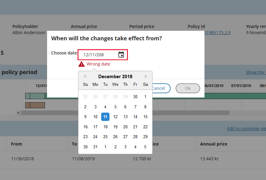
Date picker validation
To maintain consistency in error messaging, push the calendar layover (that displays months) down so that the error message displays under the input field, but above the calendar overlay. This preserves the users´ context and also provides them the ability to correct the error by choosing a valid date.
Implementation example
<fieldset class="relax-form-group">
  <label for="date">Date:</label> <input data-size="large" placeholder="Input date" type="date" id="date" name="date" />
</fieldset>Sliders @relax/sliders@8.16.11
Sliders provide a visual indication of adjustable content, where the user can move the handle along a horizontal track to increase or decrease the value.
Installation
If you do not want to use the complete bundle, you can install the component separately.$ npm i @relax/slidersUsing styles
@import '@relax/sliders';Usage
The Slider in its basic form should be accompanied by a label and a number input that can demonstrate the slider input's increase or decrease. The basic slider does not include values as the slider represents a percentage of 0-100. In this case it is not necessary for a user to choose a specific value, but instead generally increase or decrease an input. For example, the user increases the Slider amount and the volume of the music gets louder. The more complex versions should be used for selecting a specific value within a value range.
Users can choose a numerical value by:
- Entering the exact value into the text field.
- Moving the Slider handle with their mouse, which automatically updates the value in the Text Input.
- Using the ↑ ↓ ← → arrow keys automatically updates the value in the Text Input and moves the Slider handle to the corresponding value.
- The step size increment is how many increments the inputted value and Slider handle will jump when using the arrow keys. Make sure to set the step size increments to reasonable values.
- ↑ ↓ ← → changes the value by one step size increment. (Example: Pressing → changes the inputted value from 59 to 60, increasing the value by 1 unit.)
- Shift + ↑ ↓ ← → changes the value by 10 step size increments. (Example: Typing Shift + → changes the value from 60 to 70, increasing the inputted value by 10 units.)
Anatomy
Best practices
- The Slider label should indicate what value the Slider is changing.
- Range values are used to describe the range in numbers.
- Do not use for ranges that are extremely large (ex. 1-1000).
- Do not use for ranges that are too small (ex. 1-3).
Implementation
<form class="relax-form">
  <fieldset>
    <div class="relax-form">
      <label for="fader">Volume</label>
      <div class="relax-form-group relax-form--horizontal" style="flex-wrap: nowrap;">
          <span class="relax-slider-min">0</span>
          <input aria-valuemax="100" oninput="onUpdate(value)" aria-valuemin="1" aria-valuenow="50" id="fader" max="100" min="1" step="1" type="range" value="50">
          <span class="relax-slider-max">100</span>
          <input id="volume" type="number" value="50">
      </div>
    </div>
  </fieldset>
</form>
const onUpdate = vol => {
document.querySelector('#volume').value = vol;
document.querySelector('#fader').setAttribute('aria-valuenow', vol);
};